Table of Contents
I. Introduction
II. Raw Materials
A. List of Pollutants
B. Monitoring Data
i)
Completeness check and computation of annual averages
ii)
MDL
iii)
Flagging
a) Dubious accuracy
b) Border sites
c) Known missing sources
C. Emissions Inventory
i)
NTI
ii)
EMS-HAP
D. Model Results
i)
Estimates at monitoring sites
ii)
Estimates at census tract centroids
III. Model-to-Monitor Comparison Analysis Methods
A. Graphical
i)
Scatter plots
ii)
Ratio box plots
B. Statistical
i)
Number of sites
ii)
Median of ratios
iii)
Percent of sites estimated "within a factor of x"
iv)
MAXTOMON
IV. Uncertainties
A. History Of Model-to-Monitor
Comparisons With ASPEN
B. Uncertainties Affecting Our
Comparison
i)
Monitoring uncertainties
a)
Temporal gaps
b)
Spatial gaps
c)
MDL
d)
Monitor siting
e)
Location
ii)
Emissions uncertainties
a)
Point sources
1) Location
2) Stack parameters, fugitive vs. stack
b)
Spatial and temporal allocation in EMS-HAP
iii)
Model uncertainties
a)
Interpolation
b)
Deposition
V. General Results
A. Overall
B. Benzene
C. Other Gases
D. Metals
i) Lead
a)
MAXTOMON results
b)
Location uncertainty results
1) The Missouri source
2) The Tennessee source
3) The Florida source
ii)
Cadmium
iii)
Chromium
VI. Conclusions
VII. References
I. Introduction
One way to evaluate the usefulness and limitations of a dispersion
model like the Assessment System for Population Exposure Nationwide
(ASPEN) is to compare its ambient concentration predictions
to available concurrent monitoring data. As part of the
National Air Toxics Assessment (NATA) initial national-scale
assessment, the ASPEN model has predicted annual average ambient
concentrations for 34 hazardous air pollutants (HAPs), 33 urban
HAPs plus diesel particulate matter, at approximately 60,000
census tract locations nationwide for the year 1996. In
1996 there were only several hundred air toxics monitoring sites
all across the US. Many of these sites, which were primarily
designed and maintained under existing criteria air pollutant
monitoring programs (e.g., Photochemical Assessment Monitoring
Stations, or PAMS; State and Local Air Monitoring Stations,
or SLAMS; Interagency Monitoring of Protected Visual Environments,
or IMPROVE), only monitored a handful of HAPs for a limited
period of time. Where data allow us, we can look at the
1996 annual averages from these sites for whichever HAPs they
monitor, and compare these annual averages to the 1996 annual
averages generated by ASPEN for the appropriate geographic location.
By comparing the ASPEN predictions with the available monitoring
data, we hope to gain a better understanding of the overall
performance and limitations of the quantitative ASPEN model
predictions. It is these ASPEN model predictions that
will be used in the initial national-scale assessment to predict
exposure and risk values nationwide. These predicted exposure
and risk levels will subsequently help the Agency in setting
priorities for future control efforts of our air toxic programs.
This document describes the results of a model-to-monitor
comparison we conducted for a subset of the 33 urban HAPs.
We view this comparison as a evaluation of not only ASPEN,
but also its inputs: emissions data from various sources including
the National Toxics Inventory (NTI), the Emissions Modeling
System for Hazardous Air Pollutants (EMS-HAP), and meteorological
data.
For most of the pollutants examined, we found that the model's
estimates tend to be lower than the monitor averages at the
exact locations of the monitors. However, for some HAPs,
there are usually high modeled concentrations in the vicinity
of the monitor. So it may be presumptuous to say that
the modeling system underestimates the monitors. It
may just be finding a peak concentration in a different place
from the monitor.
However, in general, it appears that the modeling system
is underestimating the monitors. We discuss some possible
reasons for this. The National Toxics Inventory (NTI)
is missing some emissions sources, and for many of the sources
in the NTI, some of the emissions parameters are defaulted
or missing. It is also possible that emissions rates
are being underestimated in many places. We believe
the ASPEN model itself is contributing in only a minor way
to the underestimation. We think this because output
from the antecedents of the ASPEN model compared favorably
to monitoring data in cases where the emissions and meteorology
were accurately characterized and the monitors took more frequent
readings; and in simulations we ran, the ASPEN model's estimates
compared favorably to the estimates derived from a more meticulous
model. Monitor siting may have contributed to the underestimation,
in that they are normally sited to find peak pollutant concentrations,
which implies that errors in the characterization of sources
would tend to make the model underestimate the monitors.
Finally, we are not sure of the veracity of the monitor averages,
which have their own sources of uncertainty.
Our results suggest that the model estimates are uncertain
on a local scale; i.e., at the census tract level. We
believe that the model estimates are more reliably interpreted
as being a value likely to be found within 30 km of the census
tract location.
These results are consistent with the results of an evaluation
of 1990 ASPEN output,1 which was conducted
as part of the Cumulative Exposure Project (CEP). There
are many differences between the evaluation for the 1990 assessment
and the 1996 assessmentdifferent evaluation methods, different
emissions inventory, different list of pollutants assessedbut
most of the model estimates there, as here, were lower than
the monitor averages.
Because of all the uncertainties involved, we focus a good
portion of our energies in this document on assessing the
uncertainties.
II. Raw Materials
A. List Of Pollutants.
The EPA has conducted this comparison for seven pollutants:
benzene, perchloroethylene, formaldehyde, acetaldehyde, cadmium,
chromium and lead. These pollutants were chosen because:
- they are a subset of the 34 air toxics considered in
the national-scale assessment;
- they represent a range of pollutant types (i.e., organic,
volatile, particulate matter);
- they are influenced by different combinations of mobile,
area and point sources, and include reactive and non-reactive
compounds; and
- EPA considers the available 1996 monitoring data for
these pollutants to be adequate for a national-scale evaluation.
Benzene and perchloroethylene are volatile organic compounds
(VOCs); formaldehyde and acetaldehyde are aldehydes; and cadmium,
chromium, and lead are metals. The VOCs and aldehydes
are gaseous, while the metals are particulate matter.
B. Monitoring Data.
EPA's Office of Air Quality Planning and Standards (OAQPS) currently
maintains an Air Toxics Data Archive of toxics monitoring data.
Much of these data are already publicly available via the Aerometric
Information Retrieval System (AIRS). The data not already
in AIRS have been collected from various monitoring agencies
by OAQPS over the past few years. More details on the
structure and contents of the Archive are available from EPA.2
EPA is hoping to make all the data in the Archive conveniently
available to the public within the next year or two.
i) Completeness check and computation
of annual averages.
The model estimates are annual averages for 1996, so all our
monitoring data are also annual averages for 1996. The
annual averages were computed as follows:
1. A measurement was considered below the method detection
limit (MDL) if either it is indicated as being below the MDL
(e.g., value of 888 in the data archive), or if it was specified
with a numeric value that is lower than the reported MDL value
for that pollutant/monitor/time combination. If there
was no reported MDL, the lowest reported value for the pollutant/monitor
combination was assumed to be the plausible MDL. Measurements
below the actual or plausible MDL were assigned one of three
values depending on the averaging statistic being calculated:
- One-half the value of the actual or plausible MDL
- The value of the actual or plausible MDL
- Zero
All annual averages used in this document are of the first type.
2. For each pollutant/monitor combination, an annual
average was calculated stepwise from temporal averages of
shorter durations, as indicated below. At each step
the data set was assessed for completeness and retained for
further processing only if the completeness criteria were
met for the given averaging period.
a. Daily average. A
day was considered complete if the total number of hours monitored
for that day is 18 or more (i.e., 75 % of 24 hours).
For example, 18 hourly averages, 3 six-hour averages, or 3
eight-hour averages would satisfy the daily completeness criteria.
b. Quarterly average.
Calendar quarters are Winter (Jan-March), Spring (April-June),
Summer (July-Sept), and Fall (Oct-Dec). A calendar quarter
was considered complete if it has 75 % or more complete days
out of the expected number of daily samples for that quarter,
and if there were at least 5 complete days in the quarter.
To determine the expected number of daily samples, the most
frequently occurring sampling interval (days from one sample
to the next sample) was used; in cases of ties, the minimum
sampling interval was applied.
c. Seasonal average. The
seasons are composed of 2 quarters: Winter/Fall and Spring/Summer.
A season was considered complete if it had at least 1 complete
quarter.
d. Annual average. An annual
data set was considered complete if it had 2 complete seasons.
ii) MDL.
The MDL is the lowest level at which we have confidence in a
monitored value. It is defined
in the Code of Federal Regulations3 as the lowest
value at which we can be 99% confident that the true concentration
is nonzero. This value varies by pollutant and by monitor.
As described above, in the computation of the monitor averages
used in this document, hourly and daily monitor readings below
the MDL were replaced by one-half the MDL. For some pollutant/monitor
combinations with complete data for 1996, many of the monitor
readings are below the MDL.
For these low concentration sites, we do not have much confidence
in the monitored annual averages, because of the uncertainty
introduced when replacing values below MDL with one-half the
MDL. Because of this uncertainty, only pollutant/monitor
combinations with at least 50% of data above the MDL were
included in the comparison. In the CEP
model-to-monitor comparison,1 only pollutant/monitor
combinations with at least 90% of data above the MDL were
included. The cutoff percentage we chose was a compromise
between ensuring high quality monitoring data and ensuring
that our sample size was large enough to compute meaningful
statistics. In general, we believe that monitored averages
for pollutant/monitor combinations which have more than half
their observations below the MDL are too uncertain to be used
in a model-to-monitor comparison.
iii) Flagging.
We discarded pollutant/monitor combinations from the model-to-monitor
comparison if any of the following were true:
- We have reason to doubt the accuracy of the monitoring
average.
- The site is very close to an international border.
- We know that a source in the vicinity of the monitoring
site is missing from the emissions inventory.
a) Dubious Accuracy.
We discarded pollutant/monitor combinations for which we had
reason to doubt the accuracy of the monitoring annual average.
In areas with few major point sources, we would expect both
toluene and benzene (both HAPs emitted primarily by mobile sources)
to be highly correlated in the ambient air. Thus, if a
site had an unusual ratio of toluene to benzene, we discarded
the site from the site list for benzene. The same is true
of formaldehyde and acetaldehyde; sites with odd ratios of formaldehyde
to acetaldehyde were eliminated from the site list for both
pollutants. Sites which had extremely high monitoring
values compared to other values for that pollutant were also
discarded.
b) Border Sites.
Some of the monitoring sites are very close to the US-Mexico
border or the US-Canada border. Because we are not using
emissions data for Mexico or Canada, we do not have confidence
in the model estimates for these sites. This is especially
true of sites in Calexico, CA; El Paso, TX; Brownsville, TX;
and Bellingham, WA. These sites are close to large cities
on the other side of the US border.
Even though we discarded these sites from the comparison,
it should be noted that we are using model estimates
at census tracts along the border in NATA. In preliminary
runs, the model estimates were much lower than the monitor
averages at these sites for all pollutants. The model
estimates will almost certainly be low for census tracts near
international borders, especially when large sources are located
on the other side of the border. The absence of emissions
data from Mexico and Canada is a weakness of NATA.
c) Known Missing Sources.
In a few cases, by the end of the study, we discovered that
a source near a monitor had been missing from the initial
emissions inventory. We discarded these pollutant/monitor
combinations because they skewed our results (the model estimate
is near zero, but the monitor average is significant) and
because they do not provide a meaningful test of model performance.
We will add these missing sources to the NTI for the future.
Only a few pollutant/monitor combinations were discarded for
this reason.
Future evaluations of the ASPEN modeling system should not
exclude sites along the border or sites associated with missing
emissions sources, in order to better evaluate the performance
of the modeling system in its entirety. We recommend
including these sites in the analyses and explaining any disagreement
between model estimates and monitor averages, instead of discarding
them.
C. Emissions Inventory.
The ASPEN model uses emissions and meteorology as inputs.
The "raw" emissions inventory data is primarily from the National
Toxics Inventory (NTI). The data in the NTI are further
processed and made "model-ready" by the Emissions Modeling System
for Hazardous Air Pollutants (EMS-HAP). A user's guide
on EMS-HAP will be available soon.
i) NTI.
The NTI contains air toxics emission estimates for four source
types: major, area and other, onroad mobile, and nonroad mobile.
Some of these sources are point sources with specific geographic
coordinates; these fall into the "major" or "area or other"
category, depending on the amount of emissions. The remaining
non-point sources are summarized at the county level.
We have more extensive information about the NTI elsewhere on
the NATA web site, so we will not discuss too many specific
details here. The NTI is a very important input to the
model. Estimates from the ASPEN model are highly sensitive
to emission rates, locations, and release parameters such as
height and velocity, in the vicinity of sources. Much
of our study of the uncertainties of the model estimates in
this paper focus on the NTI. It is an enormous undertaking
to estimate emissions for each source nationwide, and the NTI
understandably has some differences from reality.
ii) EMS-HAP.
For mobile and area sources, NTI estimates are at the county
level. All NTI emissions represent total annual emissions.
The ASPEN model, however, requires higher resolution both temporally
and spatially. EMS-HAP allocates the emissions from the
NTI temporally and spatially, for use by the ASPEN model.
Temporally, EMS-HAP allocates the annual total emissions
into eight three-hour periods within an annually averaged
day. Each day of the year is allocated the same emissions.
EMS-HAP spatially allocates non-point, county-level emissions
to the census tracts within each county, as required by the
ASPEN model. EMS-HAP allocates these emissions based
on surrogates such as population, land use, roadway miles,
etc., depending on the source category. For point source
emissions, spatial allocation is not performed because most
point sources in the NTI already have exact latitude/longitude
coordinates. When point source geographic coordinates
are missing, EMS-HAP defaults them where possible. For
example, if the geographic coordinates for a point source
are missing but the zip code is not, EMS-HAP assigns the lat/lon
coordinates of the zip code's centroid to the source.
If the zip code is missing but the county is not, EMS-HAP
assigns to the source the lat/lon coordinates of a census
tract centroid chosen randomly from the county.
We will discuss some of EMS-HAP's allocation and defaulting
techniques in the uncertainties section of this document.
D. Model Results.
Two types of model estimates are used in this comparison: estimates
at the exact location of the monitors, and estimates at every
census tract centroid in the U.S. The first type of estimates
were generated especially for the purpose of doing a model-to-monitor
comparison. The second type of estimates are an integral
part of NATA; these estimates are fed into the exposure and
risk assessments.
i) Estimates at monitoring sites.
We used the ASPEN model to estimate concentrations at the exact
locations of the monitors, to get point-to-point comparisons.
Most of the analyses in this document use the results of this
point-to-point comparison. There is nothing different
about running ASPEN for monitor locations than for census tract
centroids.
ii) Estimates at census tract
centroids.
All other model results on the NATA web page use the tract-level
model estimates. We use the tract-level estimates in this
comparison for the MAXTOMON test described in section III.B.iv.
III. Model-to-Monitor Comparison Analysis
Methods
We describe some of the analytical tools used in this document
below. All but one of the following tools deal with point-to-point
comparisonsthey examine whether the model's estimates agree
with the monitor's estimates at the exact monitor location.
The one that does not use only a point-to-point comparison is
the MAXTOMON tool, which compares the monitor average to the
maximum of model estimates within a circle around the monitor.
This type of test allows for more uncertainty in the locations
of sources and monitors, release heights, meteorology, etc.
A. Graphical.
i) Scatter plots.
Scatter plots are a relatively straightforward graphical way
to show the relationship between two variables. We simply
plot model estimates of annual averages against monitor averages.
Each ordered pair on the graph is (model, monitor), for each
monitoring site for that pollutant. For example, if we
have 90 monitors for benzene, we will have 90 ordered pairs
to plot. We will also show the 2:1, 1:1, and 1:2 lines
on the plots. We consider the model estimates to be reasonable
for a pollutant/monitor combination if the point falls between
the 2:1 and 1:2 lines. In modeling parlance, we call this
"agreement within a factor of 2". We think the model is
performing reasonably well for a given pollutant if most of
the points fall between the 2:1 and 1:2 lines.
ii) Ratio box plots.
Ratio box plots show the same data in the scatter plots,
in a different way. Each box shows the distribution
of model-to-monitor ratios. So if we have 50 monitors
for perchloroethylene, we will have 50 model/monitor ratios
to compute. We then compute percentiles and the mean
of these 50 numbers, and create a box plot.
The plots will show the median, 25th, and 75th percentiles
of the ratios. If the model is performing well, the
box plots will be short, and centered at around 1.
We decided not to show more extreme percentiles (e.g., 10th
and 90th) of the ratios because often the extreme
percentiles were far from the center of the distribution.
This is an unfortunate property of ratios. When the
denominator is near zero, the ratio can be enormous.
In our study, sometimes model estimates of near zero are paired
with significant monitor averages, due to missing sources
or sources with defaulted or incorrect locations. These
result in ratios near zero, which skew the distribution of
the ratios. Less often, we'll see high model estimates
paired with low monitor averages. But because ratios
take extreme values so often, we decided to only show the
interquartile range of the distribution.
There is an additional reason for leaving out the extreme
percentiles. Given values with large uncertainty, high
percentiles tend to be biased high and low values tend to
be biased low.4 This is because the values
with large positive errors will collect in the high end of
the distribution, and values with large negative errors will
collect in the low end of the distribution. The ratios
are fraught with uncertainties of all kinds.
We decided to use a logarithmic scale for the vertical axis,
for the following reason. If we use a regular arithmetic
scale on the vertical axis, then a ratio of 2 is twice as
far from 1 as a ratio of 1/2. But as said before, modelers
typically speak of estimates as "within a factor of x."
An underestimate by a factor of x should look
just as erroneous as an overestimate by a factor of
x. The logarithmic scale makes the overestimation
and underestimation the same distance from the horizontal
line where the ratio is 1.
The ratio box plots in this document will be shown side-by-side,
one for each pollutant. This will allow us to see easily
which HAPs are being overestimated and underestimated, and
which are being estimated consistently and inconsistently.
B. Statistical.
i) Number of sites.
The number of sites is the number of monitors for each pollutant
which were not filtered out by any of the criteria in section
II.B. The more monitors, the more data we have, and the
more we can trust the findings in the comparison. Lead
and benzene are the pollutants in this paper with the most monitors.
ii) Median of ratios.
The median of ratios is based on the model/monitor ratios for
a given pollutant. A median close to 1 suggests that the
model overestimates the monitors about as often as it underestimates
the monitors. This statistic is also shown on the ratio
box plots.
iii) Percent of sites estimated
"within a factor of x".
This statistic is also based on the model/monitor ratios for
a given pollutant. We will often look at the percent of
sites for a given pollutant which agree within a factor of 2,
which is the percent of sites for which the model estimate is
somewhere between half and double the monitor average.
We'll also talk about the percent of sites estimated within
30%: this is the percent of sites for which the model/monitor
ratio is between 0.7 and 1.3.
iv) MAXTOMON.
This technique compares the MAXimum model estimate within
r kilometers of the monitor TO the MONitor average.
All model estimates are considered in finding the maximumboth
estimates at monitor sites and estimates at census tract centroids
(see section II.D above). This is an example of a point-to-range
tool. We use this tool to test whether the frequent
underestimation by the model at monitoring sites was due to
location uncertainties, or due to systematic underestimation.
To explain further, let's say the model estimate for a certain
pollutant/monitor combination was much lower than the monitor
average. We might wonder if the model predicted a concentration
similar to the monitor average anywhere near the monitor site.
If it did, it is possible that the underestimation at the
exact monitor site was due to uncertainties in the inputs
to the model, especially in source locations, instead of due
to systematic underestimation by the model.
In general, we hope to see very few monitor averages underestimated
by the model as r gets large. One weakness of
the MAXTOMON test is that there is a sparser network of model
receptors in rural areas than in urban areas, because the
census tracts are larger. Thus, the MAXTOMON test might
have more difficulty finding a peak concentration in a rural
area than an urban area.
IV. Uncertainties
In this section, we will look at some of the sources of uncertainties
which factor into the comparison. We will begin with a
historical overview of model-to-monitor comparisons done with
ASPEN, to get an idea how ASPEN results compare to monitored
concentrations when the comparison is done on a smaller scale,
and to provide a historical context for our own comparison.
In these cases, the emissions, meteorological, and monitoring
data are more likely to be of higher quality than ours.
We will then assess some of the uncertainties involved with
the emissions and monitoring data, as well as some of the uncertainties
introduced by the ASPEN dispersion model itself.
A. History Of Model-to-Monitor Comparisons
With ASPEN.
In the early years of air dispersion modeling, say prior to
1968, calculations were completed with paper, pencil and hand
calculators. Early computers were limited in their memory capabilities.
This spawned the development of a particular type of dispersion
model which employed a statistical summary of meteorological
conditions, which then required a special algorithm for characterizing
the resulting dispersion. Early examples of this type
of model were described by Meade and Pasquill5 and
Lucas.6 The idea was relatively simple, but
most of the algorithms for characterizing the basic processes
(e.g., buoyant plume rise, plume dispersion, depletion, etc.)
were simplistic with little experimental verification.
Basically, a computation was made for each expected wind speed
and stability condition whose probability of occurrence was
computed for wind sectors surrounding the source (varying from
12 to 16 wind sectors). The average concentration was
computed by summing for each wind sector the computed concentration
at each downwind distance, multiplied by the frequency of occurrence
of each wind speed and stability combination.
Pooler7 described one of the first attempts to
employ numerical methods for automating the computations (an
IBM 650 computer) to provide estimates of monthly average
concentration values for comparison with observations of sulphur
dioxide (SO2) collected daily from November 1958
through March 1959 at 123 sampling sites in Nashville, TN.
We have to temper the evaluation results, as regressions were
performed with the observed concentration values to provide
best estimates of the variation of the monthly emission rates
from the known sources. When we digitized Pooler's data
for reanalysis we only found 122 data values, not 123.
That said, the model overestimated the observed values by
a factor of 1.37 with a correlation coefficient (r2)
of 0.95. (Note: In all descriptions of past model-to-monitor
comparisons in this section, the reported factor of over or
under estimation and correlation coefficient (r2)
were deduced through a linear regression with the intercept
forced to be at the origin.) We found 110 of the 122
values within a factor of 2 of the observed values, with 74
of the 122 values within 30%.
Martin8 summarized the dispersion model used to
numerically compute (an IBM 1130) winter season estimates
of the average SO2 concentration values for comparisons
with observations collected daily from December 1964 through
February 1965 at 40 sites in the St. Louis area. Removing
comparison results for the five most suspect locations reduced
the overestimation to 1.47 and increased the correlation coefficient
to 0.95. Thirty-four of the 35 values were within a
factor of 2, with 14 within 30%. A reanalysis of these
same data was performed by Calder9 using the Climatological
Dispersion (CDM) model, using a revised characterization of
the area source emissions by Turner and Edmisten.10
A major enhancement within the CDM over the model employed
by Martin was to incorporate an improved treatment for characterizing
dispersion from area sources, employing an algorithm based
on the narrow plume hypothesis. In spite of the attempts
to improve the characterization of area source emissions and
the dispersion from these low-level sources, the comparison
results were similar to those achieved by Martin. The
CDM tended to overpredict concentration values by a factor
1.54 with a correlation coefficient (r2) equal
to 0.92. Thirty-five of 39 estimates where within a
factor of 2, with 17 within 30%. Possible factors contributing
to the tendency to overestimate the observed concentration
values were: an inherently crude emissions inventory, no day
versus night variation in emission rates, and the crude estimates
of mixing height employed.
Turner et al.11 summarized the results obtained
in applying the CDM model to estimate annual average particulate
and SO2 concentration values for the New York area
for 1969. SO2 observations were available
for comparison at 75 locations and total suspended particulate
matter observations were available for comparison at 113 locations.
This version of the CDM employed the Briggs12 plume
rise algorithms (in contrast to use of Holland13
algorithms used by Martin and Calder in the St. Louis comparisons).
For SO2 it appears the CDM tended to slightly overpredict
concentration values by a factor of 1.11 with a correlation
coefficient (r2) equal to 0.90. Seventy-one
of the 75 values were within a factor of 2, with 47 values
within 30%. For particulates it appears the CDM tended
to slightly underpredict concentration values by a factor
of 0.93 with a correlation coefficient (r2) equal
to 0.94. 111 of the 113 values were within a factor
of 2, with 94 within 30%.
Irwin and Brown14 summarized the results obtained
in applying the CDM model to estimate 1976 annual average
SO2 concentration values for the St. Louis area.
There were 13 sites, but omission of a lead smelter near one
site precluded use of data at two sites for model performance
comparisons. The emission inventory and monitoring results
were obtained as part of the St. Louis Regional Air Pollution
Study. These simulations differ with those computed
by Turner et al. in that urban dispersion parameters (based
on tracer studies conducted in St. Louis, McElroy and Pooler15
and Gifford.16 It was determined that although
the area source emissions constituted only 3.5% of the total
area and point source emissions, estimated concentrations
from area sources ranged from 14 to 67% of the total concentration
estimated at the monitoring sites. For the 11 sites
it was found that CDM slightly overpredicted concentration
values by a factor of 1.10 with a correlation coefficient
(r2) equal to 0.96. Nine of the 11 sites
have estimates within a factor of 2, with 3 values within
30% of those observed. This same inventory was simulated
using the RAM model,17 which employed hourly specification
of the meteorology and the emissions. For the 11 sites
it was found that RAM slightly overpredicted concentration
values by a factor of 1.10 with a correlation coefficient
(r2) 0.96. For the RAM estimates, all 11
sites had estimates within a factor of 2, with 10 values within
30% of those observed.
The version of CDM applied by Irwin and Brown is similar
to the Industrial Source Complex (ISCLT) Long-Term model.18
The major difference in ISCLT versus CDM is that the area
source algorithm is better than that employed in CDM.
ISCLT's area source dispersion characterization nearly approximates
what is obtained when one computes area source impacts using
an hour-by-hour simulation (which employs a double integral
over the area and hence is our best expression of dispersion
from an area). The emphasis on improving the treatment
of area source impacts reflects the recognition that area
source emissions (if present) often account for a major portion
of the simulated impacts, as discussed in the previous paragraph.
In the studies summarized in the table below, it is important
to remember that the long-term models have evolved, with the
adoption of improved characterizations for the dispersion
and for treatment of area sources. Except for the simulations
for Nashville by Pooler and for St. Louis by Martin and Calder,
the average bias has been slight. The CDM versus RAM
comparisons offer an interesting clue that perhaps the time
variation of the emission rates (which Calder was the first
to offer as a major concern) is of importance, although there
are other differences between CDM and RAM that also might
offer explanation of the differences seen. Regardless
of the model employed, the estimates are generally within
a factor of 2 of those observed.
|
| Table 1. Summary of long-term model simulation
comparisons. Note the tendency for over or underprediction.
The correlation coefficient (r2) is based on a linear regression
with the intercept specified as the origin. |
| Study |
Number of
Values |
Over/Under
Factor |
Correlation
(r2) |
Within Factor
of 2 |
Within 30% |
| Pooler (1961) Nashville SO2 |
123 |
1.37 |
0.92 |
90% |
61% |
| Martin (1971) St. Louis SO2 |
35 |
1.47 |
0.94 |
97% |
40% |
Calder (1971)
St. Louis SO2 CDM |
39 |
1.54 |
0.92 |
90% |
44% |
Turner et al. (1971)
New York SO2 CDM |
75 |
1.11 |
0.90 |
95% |
49% |
Turner et al. (1971)
New York Particulates CDM |
113 |
0.93 |
0.94 |
98% |
83% |
Irwin and Brown (1984)
St. Louis SO2 CDM |
11 |
1.10 |
0.96 |
82% |
27% |
Turner and Irwin (1983)
St. Louis SO2 RAM19 |
11 |
1.10 |
0.96 |
100% |
91% |
B. Uncertainties Affecting Our Comparison.
i) Monitoring uncertainties.
It is tempting to treat the monitoring data as "truth": a fixed
target which the model is trying to hit. However, our
monitoring data is a coarse conglomeration of any monitoring
data available. In more small-scale, careful model-to-monitor
comparisons, such as the ones considered in the previous section,
it is more likely that only high-quality monitoring data is
used. But our comparison is conducted on a large scale,
with data from a wide variety of monitoring agencies.
Unlike the criteria air pollutant world, there currently is
no formal national air toxics monitoring network which follows
standardized EPA guidelines or established national monitoring
procedures. While several States and local agencies have
collected some high quality HAP monitoring data, some of the
data have not undergone any formal quality assurance tests,
and the data come from several different monitoring networks,
which may vary in precision and accuracy. In general,
we would expect the precision and accuracy of air toxics monitoring
data to be not nearly as good as the SO2 and particulate
matter monitoring data used in the studies in the previous section.
We will discuss some of the other monitoring uncertainties in
more detail below.
a) Temporal gaps.
Most of the 1996 data in the Archive were not collected every
day. Instead, they were produced every 12th day or every
6th day throughout the calendar year. Our completeness
criteria discussed in section II.B.i above filter out pollutant/monitor
combinations which have many missing sample days, but
they do not filter out pollutant/monitor combinations based
on the number of missing calendar days. Our only
requirement for the calendar days is that we have at
least five days in either the winter or fall quarter and in
either the spring or summer quarter. This is not a very
rigorous standard. The temporal gaps are especially
problematic for pollutant/monitor combinations which have
widely varying concentrations throughout the year. This
might be true for pollutant/monitor combinations where the
weekday and weekend concentrations are very different, or
those near sources whose emissions vary widely from day to
day.
b) Spatial gaps. For
some of the pollutants in this study (section II.A above),
we have very few sites across the country. The table
below shows the number of monitors and the number of states
covered for each pollutant.
|
| Table 2. Geographic coverage of monitoring data,
by pollutant. |
| Pollutant |
Number of Sites |
Number of States |
| Benzene |
87 |
16 |
| Perchloroethylene |
44 |
8 |
| Formaldehyde |
32 |
10 |
| Acetaldehyde |
32 |
10 |
| Lead |
242 |
28 |
| Cadmium |
20 |
7 |
| Chromium |
36 |
6 |
|
We only have 20 complete monitors for cadmium, 13 of which
fall in Illinois and New York. Acetaldehyde and formaldehyde
have exactly the same set of 32 monitors, 28 of which fall
in the northeastern and Great Lakes states. Of the 36
chromium monitors, 32 are in California, New York, and Illinois.
All 10 chromium monitors in New York are in Staten Island.
The situation for benzene and lead is much better, as the
table shows. In general, the southeastern, northwestern,
Great Plains, and Rocky Mountain states are very sparsely
monitored. The northeastern and mid-Atlantic states,
Great Lakes states, California, Texas, and Louisiana are fairly
well monitored.
c) MDL. As discussed
in section II.B.ii above, values below MDL add uncertainty
to the annual averages. We dealt with this by eliminating
from the comparison all pollutant/monitor combinations for
which less than 50% of the daily observations were above the
MDL. Still, many of the pollutant/monitor combinations
have barely more than 50% of daily observations above the
MDL. Of the 493 pollutant/monitor combinations, 36 (7.3%)
have between 50% and 60% of daily observations above the MDL.
Chromium is the most uncertain pollutant in this respect:
13 of the 36 monitors (36%) have less than 60% above the MDL.
|
| Table 3. Percent of daily values above MDL, by
pollutant. Many of the monitors have a large percentage of data
below MDL, especially for chromium. |
|
|
Number of Sites With Percent of Daily Values Above MDL |
| Pollutant |
Number of Monitors |
50% to <60% |
60% to <70% |
70% to <80% |
>=80% |
| Benzene |
87
|
8
|
2
|
4
|
73
|
|
Perchloroethylene
|
44
|
2
|
0
|
1
|
41
|
| Formaldehyde |
32
|
0
|
0
|
0
|
32
|
| Acetaldehyde |
32
|
0
|
1
|
0
|
31
|
| Lead |
242
|
12
|
8
|
11
|
211
|
| Cadmium |
20
|
1
|
1
|
1
|
17
|
| Chromium |
36
|
13
|
3
|
4
|
16
|
| All |
493
|
36
|
15
|
21
|
421
|
| EPA is currently discussing ways to handle values below the MDL other
than just replacing them with MDL/2. Other methods may
reduce the uncertainty we have in monitor averages when many
daily observations are below the MDL.
d) Monitor siting.
The monitors used in the study were located considering a
wide variety of objectives. Some were placed near sources,
to monitor sites with high pollutant concentrations.
Others were located in residential areas, intended to measure
more typical exposures. Still others were located in
rural areas, in order to find a background concentration.
A few were run for special studies. The Archive has
information on siting objectives for some of the monitors,
but not all: 179 (36%) of the 493 pollutant/monitor combinations
used in this comparison had missing site objective codes.
Also, there are no specific guidelines for when an air toxics
monitor should be classified as "source-oriented", "population-oriented",
"background-oriented", etc., so even for those monitors with
siting objective information in the Archive, we cannot be
sure of the quality or consistency of such data.
Generally, most monitors are sited to find
peak concentrations. We use this assumption in the interpretation
of the MAXTOMON results.
e) Location. How trustworthy
are the exact (latitude,longitude) coordinates of the monitors
used in this comparison? This is difficult to assess.
One way to assess this is to see how often the monitor's lat/lon
coordinates fall in a different county from the one reported
in the Archive. Another is to take a Global Positioning
System (GPS) out to some monitors and check its readings with
the values in the Archive.
We performed the first test using a Geographic
Information System (GIS) software package and the US counties
coverage which is included with the software. Of the
493 pollutant/monitor combinations, only one has lat/lon coordinates
which fall more than 5 km from the reported county.
This monitor is in Louisiana. We didn't look at monitors
which are outside of the reported county by less than 5 km,
because these discrepancies are likely due to lack of geographic
detail in the counties coverage rather than erroneous lat/lon
coordinates. The one in Louisiana only missed by 7.5
km, so even that one might be due to lack of detail in the
coverage, rather than erroneous lat/lon coordinates.
We performed the second test using three
lead monitors near a source in Herculaneum, Missouri.
Mick Daye, an EPA modeler from Region 7, took GPS readings
at each monitor. We compared Mick's coordinates to those
in the Archive, and here is what we found:
|
| Table 4. Comparison of lat/lon coordinates for
three monitors in Archive to GPS readings. These discrepancies
may affect model-to-monitor agreement. |
| AIRS Monitor ID |
Monitor Name |
Distance Apart (meters) |
| 290990015 |
Broad Street |
80 |
| 290990005 |
High School |
50 |
| 290990011 |
Bluff |
170 |
|
These are significant differences for a model-to-monitor
comparison, which we will see in the emissions uncertainties
section. Since most lead emissions come from widely
spaced industrial plants, with little contribution from well
dispersed sources, there are often steep concentration gradients
near a source. A difference of 50 meters might not have
much of an effect, but a difference of 170 meters would.
We will discuss this further in the emissions uncertainties
section: it is very important to get the source-receptor geometry
correct when using a model to estimate concentrations near
an isolated point source.
ii) Emissions uncertainties.
In light of the discussion in section IV.A above, we believe
that the accuracy of the emissions, including source location
data, is the single most important factor affecting the performance
of the model. Thus, we focused a lot of our attention
on the uncertainties surrounding the emissions. Missing
point sources is a major problem when it occurs, and difficult
to assess. The majority of the emissions inventory was
compiled in cooperation with state and local agencies.
We considered emissions data submitted from these agencies to
be the best data sources in the enissions inventory. Where
agencies did not submit data and where there were obvious omissions,
we supplemented with emissions information gathered via EPA
regulatory development and with the industry-supplied emissions
reported to EPA Toxics Release Inventory (TRI). One convenient
way we have to assess whether a state is likely to have missing
sources is its level of participation in submitting a point
source inventory to EPA.
a) Point sources.
Of the pollutants we investigated, the point source contribution
to the modeled concentrations is highest for the three metals.
Thus, our investigation of point source uncertainties will
focus on the metals. Some of the emissions data variables
that are important for accurate modeling are location, release
height, and emissions rate. We discuss uncertainties
surrounding the first two variables below.
1) Location. We
will now give a brief explanation of the way EMS-HAP processes
the point source location data from the NTI. It
does this in two major ways. First, if the geographic
coordinates of the source are missing or out of range (i.e.,
outside the U.S., Puerto Rico, and Virgin Islands), it places
the source at the centroid of the zip code if that is nonmissing.
If the zip code is also missing, it places the source at a
census tract centroid chosen randomly from the county.
Second, for the sources with nonmissing geographic coordinates,
it checks if the lat/lon coordinates fall within the reported
county. If not, but the coordinates are within a distance
of 5.4 times the county radius (the county is approximated
as a circle of area equal to the county area) from the county
centroid, EMS-HAP leaves the lat/lon coordinates as is.
If the coordinates are outside this circle, EMS-HAP will move
the source to the zip code centroid if available. If
not available, it will move the point to a randomly selected
census tract centroid in the reported county. For more
detail, please consult the EMS-HAP user's guide.
There are two ways we have assessed the location uncertainties
of the point sources used in ASPEN. First, we found
out which source lat/lon coordinates fall more than 5 km outside
their reported counties, just as we did for the monitor locations.
Second, we found out which sources have locations that were
defaulted based on either the zip code or county defaulting
methods. We did this for each of the three metals.
In the table below, we looked at the percent of emissions
(by mass) from each state/metal combination coming from uncertain
locations. Each cell in the table is a link to a pie
chart, which shows in more detail the breakdown of emissions
into categories of location uncertainty. We also noted
the states which we feel are likely to have missing sources.
As said above, some states were more forthcoming than others
with respect to submitting a point source inventory.
The less forthcoming states are considered more likely to
have sources not included in the NTI. Missing sources
often cause drastic underestimates by the modeling system.
|
| Table 5. Uncertainty in point source location
data for metals, by state. Starred states were not as forthcoming
in submitting point source inventories to EPA. State/metal combinations
are denoted by O, X, XX, or XXX, depending on the percent of point source
emissions by mass which have either defaulted locations or locations falling
outside the reported county. Each state/metal combination also has
a pie chart associated with it, showing the breakdown of point source emissions
into the location categories. |
| State |
Lead |
Cadmium |
Chromium |
| Alabama* |
XXX
|
XXX
|
X
|
| Arizona |
XX
|
O
|
O
|
| Arkansas |
X
|
O
|
O
|
| California |
O
|
XX
|
X
|
| Colorado |
O
|
O
|
O
|
| Connecticut* |
XX
|
X
|
X
|
| Delaware |
O
|
O
|
O
|
| District of Columbia |
O
|
O
|
O
|
| Florida |
O
|
XXX
|
O
|
| Georgia* |
XXX
|
XXX
|
O
|
| Idaho |
O
|
XXX
|
XXX
|
| Illinois |
O
|
O
|
O
|
| Indiana |
XXX
|
XX
|
XXX
|
| Iowa* |
O
|
O
|
O
|
| Kansas |
O
|
O
|
O
|
| Kentucky |
X
|
O
|
O
|
| Louisiana |
XX
|
O
|
X
|
| Maine |
O
|
O
|
O
|
| Maryland |
X
|
O
|
O
|
| Massachusetts* |
O
|
O
|
O
|
| Michigan* |
X
|
X
|
X
|
| Minnesota |
XX
|
XXX
|
X
|
| Mississippi |
XX
|
XXX
|
XX
|
| Missouri |
O
|
XX
|
X
|
| Montana* |
X
|
O
|
O
|
| Nebraska |
O
|
O
|
O
|
| Nevada* |
O
|
O
|
O
|
| New Hampshire |
O
|
O
|
O
|
| New Jersey* |
O
|
O
|
O
|
| New Mexico |
O
|
O
|
O
|
| New York |
X
|
XX
|
O
|
| North Carolina |
O
|
O
|
O
|
| North Dakota |
O
|
O
|
O
|
| Ohio* |
XX
|
XX
|
O
|
| Oklahoma* |
XX
|
XX
|
O
|
| Oregon |
XXX
|
XXX
|
X
|
| Pennsylvania |
X
|
XXX
|
O
|
| Puerto Rico |
XXX
|
XXX
|
XXX
|
| Rhode Island |
XXX
|
XXX
|
XXX
|
| South Carolina |
XX
|
X
|
X
|
| South Dakota |
O
|
O
|
O
|
| Tennessee |
X
|
XX
|
X
|
| Texas |
XX
|
XXX
|
O
|
| Utah |
O
|
O
|
O
|
| Vermont |
X
|
X
|
X
|
| Virginia |
XX
|
XXX
|
X
|
| Washington |
XX
|
XX
|
X
|
| West Virginia |
O
|
O
|
O
|
| Wisconsin |
O
|
O
|
O
|
| Wyoming |
O
|
O
|
O
|
| All states are placed into three categories based on their level of participation
in submitting a point source inventory to the NTI: high, medium,
and low. The states in the latter two categories are starred.
As for the actual entries in the cells of the table, a state/pollutant
combination is assigned an 'O' if less than 10% of its emissions
are "location uncertain" (either from a source with a defaulted
location, or from a source falling more than 5 km outside a
county boundary); an 'X' if between 10% and 25% of sources are
location uncertain; an 'XX' if between 25% and 50% of sources
are location uncertain; and an 'XXX' if more than 50% are uncertain.
The more location uncertainty, the less faith we have in model
results for the given state/pollutant combination on a local
scale. The pie charts show the percent of emissions which
fall into each of the four location categories: county defaulted;
zip code defaulted; not defaulted but more than 5 km outside
the reported county; and not defaulted and either inside the
reported county or less than 5 km from its boundary. All
categories but the last are considered "uncertain". The
less emissions which fall into the first three categories, the
more we can trust the model results on the local scale (the
likelihood of missing sources should also be considered).
The table below shows the percent of emissions falling into
each location category, when summing across states.
The NTI has exact geographic locations for most of the point
source chromium emissions, most of which fall in the reported
county; but about 13 percent of lead emissions and 25 percent
of cadmium emissions were defaulted.
|
| Table 6. Uncertainty in point source location
data for metals, for all states. |
|
% Emissions By Mass
|
|
Metal
|
County Defaulted
|
Zip Code Defaulted
|
Not Defaulted, Outside County
|
Not Defaulted, Inside County
|
| Lead |
12.8%
|
0.3%
|
3.8%
|
83.1%
|
| Cadmium |
25.0%
|
0.2%
|
6.4%
|
68.4%
|
| Chromium |
3.5%
|
0.1%
|
3.0%
|
93.4%
|
|
In section V.D below, we'll discuss some of the results of
the location defaulting for lead in more detail. We
did a detailed study of some of the monitoring sites which
were matched up with extremely low model estimates.
2) Stack parameters, fugitive
vs. stack. The other stack parameters are as important
to model results as the locations. Slight changes in
the stack parameters can cause widely varying model results.
We'll focus mainly on the release heights. Most of our
monitors measure the concentration of a pollutant on the ground;
and the ASPEN model does the same.
EPA modelers agree that the release height is important, because
emissions released from high stacks have more air to pass
through on their way to the ground than emissions released
from ground-level. As a result, we might expect positive
errors in release height to lead to model underestimates,
and vice versa. Studies have shown that ground-level
concentrations are 5 to 8 times more affected by low level
emissions than by elevated emissions.20,21
In part to check the accuracy of the stack release heights
in the NTI, members of EPA visited a lead smelter in Herculaneum,
Missouri. According to the TRI, 89.91 tons of lead were
emitted from the 550-foot stack in the center of the facility,
and 7.66 tons were "fugitive" emissions: that is, escaping
from the facility through open doors, windows, etc.
However, the emissions for an ongoing 2-month study at the
facility suggest that the fugitive emissions are of order
50 tons rather than 7.66 tons. We can not generalize
to all other sources from one site visit, but this does reveal
the possibility of the types of emission characterization
uncertainties that can occur. All other factors being
equal, an increase from 7.66 to 50 tons in low-level emissions
would likely increase the predicted annual average for this
site by a factor of 3.
b) Spatial and temporal allocation
in EMS-HAP. One of the tasks of EMS-HAP is to allocate
NTI emissions summarized at the county level both temporally
and spatially. EMS-HAP makes numerous assumptions in
these allocation processes, which add to the uncertainty of
the model estimates. The EMS-HAP user's guide will be
available to the public soon. This guide will describe
these allocation techniques in detail. For our purposes,
it is important to note that pollutants for which area sources
contribute significantly to model estimates have more uncertain
model estimates.
iii) Model uncertainties.
A dispersion model in general makes many simplified assumptions
as to the fate and transport of the emission plume. One
of the key simplifications of the ASPEN model is that it does
not include a terrain component in its prediction algorithms.
Further, the model relies on steady-state long-term sector-averaged
climate summary data to represent the conditions at any given
plume site. The model also simplifies some complex atmospheric
chemical processes and captures only pollution transport within
50 km of any individual source.
Dispersion Calculations
ASPEN was constructed using Version 2 of the Industrial Source
Complex Long-Term model (ISCLT2). The major changes
between Versions 2 and 3 (the current version) of ISCLT were:
a new area source algorithm, a revised dry deposition algorithm,
a wet deposition algorithm, COMPLEX1 algorithms, a pit retention
algorithm. None of these changes would affect ASPEN,
as ASPEN does not use the ISCLT area source algorithm, dry
deposition algorithm, or wet deposition algorithm. Hence,
for the simple point source case, one would expect ASPEN and
ISCLT to provide similar results. To test this, a series
of runs with both ASPEN and ISCLT were made, to provide a
means for comparing the respective model's estimates.
ASPEN Calculations
The ASPEN calculations are actually distributed over a series
of separate processors. The first (ASPENA) reads in
the emissions data, and computes for each source the concentration
for a set of receptors distributed around the source location.
Receptors are located along 16 radials outward from the source
at 12 locations (ranging from 100 m to 50 kilometers).
The 16 radials are defined in a clockwise sense about the
source, with the first radial pointed due north. The
interpolation procedures are all computed within ASPENB, which
reads in the results from ASPENA, and combines this with a
listing of where concentration values are desired. In
the simplest of situations, when no spatial averaging is employed
(valid for all sources once the receptor is no longer located
within the same census tract as the source), concentrations
are interpolated using the values computed along the 16 radials.
Linear interpolation is used for a point between radials at
a fixed distance downwind. Log-log interpolation is
used for determining concentration variations as a function
of distance downwind. We will not attempt here to describe
the averaging procedures used for computing point source and
area source impacts for receptor locations within the census
tract of the source. In principal, the impacts to receptors
that are within the same tract as the emission are essentially
computed as an area-weighted average concentration for all
ASPENA receptors found within the census tract.
Test Case Meteorology
Both ASPEN and ISCLT use a Stability Array to describe the
frequency of occurrence of wind speeds and stability conditions
as a function of sixteen wind sectors going clockwise from
the north. For the test cases to be described, only
winds from the north were specified. Only neutral stability
was allowed. The mixing height was set at 1000 m and
the annual average temperature was set at 279.65 K.
The frequency of occurrence of the six wind speed categories
was specified as:
|
| Table 7. Frequency distribution of wind speed
categories used in test cases. |
| Wind Speed Category |
1 |
2 |
3 |
4 |
5 |
6 |
| Average Wind Speed (m/s) |
1.5 |
2.5 |
4.5 |
7.0 |
9.5 |
12.5 |
| Frequency of Occurrence |
0.315 |
0.169 |
0.290 |
0.197 |
0.029 |
0.000 |
|
a) Interpolation.
We specifically investigated whether the interpolation scheme
used within ASPEN might be underestimating the actual modeled
impacts. This concern arose because a "net" of receptors
is employed by ASPEN, and then concentrations at specific
points are estimated by interpolating within the "net".
We wondered whether ASPEN might underestimate peak ambient
concentrations because it "averages out" the peak values by
combining them with lower concentrations nearby.
To do this, we simulated three types of
emissions sources, and compared the ASPEN estimates downwind
from each source to the estimates derived from a more recent,
detailed version of ASPEN, the Industrial Source Complex Long-Term
Model Version 3 (ISCLT3). The simulations were run under
a variety of wind speed conditions.
The first simulated source was a point source with a 10-m
stack height. The stack gas temperature was set to be
nearly the same as the ambient temperature, and the exit velocity
was set at 1 m/s. In this case, there would be no plume
rise. Figure 1 depicts the results obtained from the
two models. It is evident that at 250 m downwind, ISCLT
provides a concentration that is greater than what ASPEN would
provide using its log-log interpolation procedures.
However, at most distances the two models provide similar
results.
|
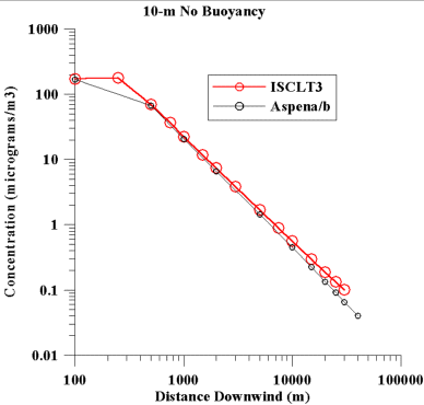
|
| Figure 1. Comparison of concentration estimated by ASPEN
and ISCLT3 for a 10-m point source, with no plume rise.
The emission rate was 1 g/s. |
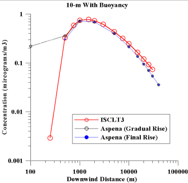
| The second simulated source is again a point source with a
10 m stack height. In this case the plume was made buoyant,
with an exit velocity of 2 m/s and an exit temperature of 495
K. The actual plume rise (Dh) is dependent on the wind
speed (u), as Dh=357/u, where Dh is in meters and u is
in m/s. Figure 2 shows the concentrations obtained from
the two models for this buoyant source. Notice that when
ASPEN is run in its normal mode, where gradual rise is used
at all distances, the ASPEN concentration at 100 m downwind
is much larger than what ISCLT estimates. Whereas if we
run ASPEN using the final plume rise at all distances (which
is how ISCLT runs), the estimates are more in line with what
ISCLT provides. The ASPEN estimates are lower than ISCLTs
by about 10% in the near distances, with the underestimation
increasing to about 25% at 30 km downwind. |
|
| Figure 2. Comparison of concentration estimated by ASPEN and
ISCLT3 for a 10-m point source, with plume rise. The emission
rate was 1 g/s. |
| As a third case, two area sources of different size were simulated within
ISCLT for comparison with those estimated by ASPEN. ASPEN
does not explicitly assign a size to area sources, so we tried
to deal with the two different source sizes by varying the area
of the census tract. In these comparisons, the emission
rates were 1 g/s from each area source (which is expressed as
g/s-m2 in ISCLT). Figure 3 depicts the comparison results
obtained. As seen in Figure 3, once one is 3 km or more
downwind, the differences are less than 20%. |
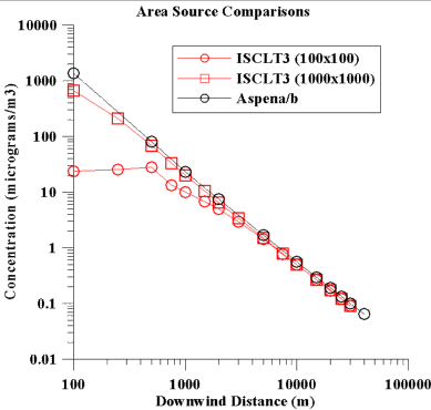
|
| Figure 3. Comparison of concentration estimated by ASPEN and
ISCLT3 for area sources with release heights of 1 m. The emission
rate was 1 g/s. The area source size for the ISCLT runs was 100m
by 100m and 1km by 1km. |
|
In these comparisons, we see no systematic bias in the ASPEN
calculations that would cause it to significantly underestimate
concentration values in comparison to what ISCLT can provide.
If anything, it may be that ASPEN may provide higher concentration
values for receptors near or within tracts with area source
emissions.
b) Deposition. The
ASPEN model simulates the effect of dry deposition of particulate
by adding an additional decay term to the emission rate in
calculation of ambient concentrations. The decay term is a
function of the deposition velocity, downwind distance from
the source, and plume dimensions with respect to the mixing
height. Deposition velocity is also a function of the
particle size, wind speed, and the land-use type. The
ASPEN model allows different deposition options for fine and
coarse particulate and urban/rural environments. In
order to analyze the effect of these options on the modeled
ambient concentrations, we performed test case simulations
using lead emissions from mobile non-road sources in Colorado.
We used different compositions of fine/coarse fractions and
held the total emission rate constant. Five different
scenarios were used for this test case: 10% fine and 90% coarse,
25% fine and 75% coarse, 50% fine and 50% coarse, 75% fine
and 25% coarse, and 90% fine and 10% coarse. Emissions
from 17 pseudo-point sources of 10 m height, 1 m/s exit velocity,
and T = 295 K were considered. For fine particles, the
deposition velocities are generally similar and scattered
around the 1:1 ratio line. The deposition velocities
for coarse particles are much higher for ASPEN than for ISCST3.
The effects of these differences was extrapolated to the national
scale. For the entire U.S., the total lead emissions
were 66.5 g/s and the percent contribution from different
source categories was as following: 49% all lead emission
were accounted for by major sources, 28% by area sources,
less than 0.01% by mobile on-road, and 23% by mobile non-road
sources. For the ASPEN simulations this means that about
50% of all lead emission sources were treated as point sources
and about 50% as pseudo point sources. We estimated
that ASPEN has a bias to predict average lead concentrations
in the air 2030% lower than one would typically predict,
because it is using coarse particle deposition velocities
that are higher than one would usually use.
The same logic applies to the other particulate
HAPs in the comparison (cadmium and chromium). We expect
that the percent of emissions in the coarse category for these
other two is less than that for lead, however, so we would
expect the underestimation bias also to be less.
V. General Results
A. Overall.
The ratio box plot below gives a general idea of the results
of the point-to-point comparison. |
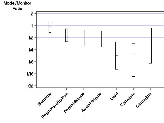 |
| Figure 4. Ratio box plot showing distribution of model/monitor
ratios for each pollutant. The bottom of each box is the 25th
percentile, the top is the 75th percentile, and the horizontal
line in the middle is the median. See section III.A.ii for more details.
Also note the number of sites summarized in each box plot (see Table 8
below). |
| For comparison to the results from the historical studies listed
in section IV.A above, the table below gives the percent of sites
estimated within 30%, and within a factor of 2. It also reports
the percent of sites which are underestimated by the modeling system.
|
| Table 8. Agreement of model and monitors by pollutant,
on a point-to-point basis. Compare to Table 1. |
| Pollutant |
Number of Sites |
Median of Ratios |
Within Factor of 2 |
Within 30% |
>Underestimated
|
| Benzene |
87 |
0.92 |
89% |
59% |
59%
|
| Perchloroethylene |
44 |
0.52 |
55% |
32% |
86%
|
| Formaldehyde |
32 |
0.65 |
53% |
28% |
88%
|
| Acetaldehyde |
32 |
0.60 |
59% |
22% |
91%
|
| Lead |
242 |
0.17 |
18% |
10% |
91%
|
| Cadmium |
20 |
0.18 |
15% |
5% |
85%
|
| Chromium |
36 |
0.15 |
28% |
19% |
83%
|
|
These results are surprising given the results of the historical
studies. The agreement in our results on a point-to-point
basis is comparable to the agreement from historical studies
for benzene only. The rest of the pollutants show poor
agreement on a point-to-point basis, with the model estimates
systematically lower than the monitor averages. From
the ratio box plot graph, we can see that this is especially
true for the three metals, which all have ratio medians of
less than 1/5: on "average", they are underestimated by more
than a factor of 5. This is most interesting for lead,
because this is a well-studied criteria pollutant, for which
we have extensive monitoring experience and an emissions inventory
which has been assembled over many years.
Because the past model-to-monitor studies in section IV.A
show much better agreement than ours, something must have
been different in our study from historical studiesand we
do not think the underestimation is due to the model itself,
because the model we used here is very similar to the model
used in historical studies. We can think of two possible
explanations for the underestimation:
- The emission rates are systematically underestimated
and/or many sources are missing from the emissions inventory.
- Many of the monitors likely were sited to find peak concentrations.
Often, the ambient concentration falls off quickly around
the peak area. Even given a perfect model and perfect
monitors, if the monitor is right at the peak and the emissions
or meteorological inputs are off even a little, the model
will underestimate. This is especially likely for
pollutants dominated by point sources with elevated releases,
because any errors in release height, exit velocity, or
emissions location might cause the model to find a peak
concentration area different from the true peak.
The MAXTOMON statistic described in section III.B.iv is especially
designed to investigate the second hypothesis.
We are currently designing a national Air Toxics monitoring
network. To get an idea of how to proceed with the national
network, we are conducting pilot monitoring studies in a few
cities across the US. The monitors in these studies
are sited in high, medium, and low concentration areas, with
a future model-to-monitor comparison as one of the goals.
We believe in terms of a model-to-monitor comparison, the
new network will be more useful than the current collection
of monitors.
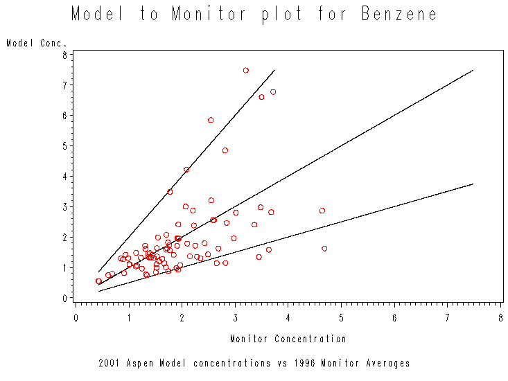
B. Benzene.
The ratio box plot (Figure 4) and short list of statistics (Table
8) in the previous section show good agreement for benzene.
Below is the scatter plot. |
|
| Figure 5. Model-to-monitor scatter plot for benzene.
Most points fall within the factor of two wedge, and none are far outside
the wedge. |
|
As expected from Figure 4 and Table 8, most of the points
in the scatter plot fall between the 2:1 and 1:2 lines.
The high concentration monitors seem to be estimated a little
less reliably: most of the points falling outside the "factor
of 2 wedge" are those with high monitor concentrations.
Some of the misses are low and some are high, but nothing
misses by much. The largest model-to-monitor ratio is
2.45 and the smallest is 0.34, so all monitors are estimated
within a factor of three.
There are several reasons why we would expect good agreement
for benzene:
- It is a widely distributed pollutant which is emitted
from point, area, and mobile sources. Thus, if the
model is biased in the way it handles any one of these source
categories, the bias will be dampened. For example,
if a point source near a monitor is mislocated away from
the monitor, there will nevertheless be significant mobile
source emissions near almost every monitor location which
will dampen the underestimate.
- We have an estimated background concentration for it.
- There is a large number of monitoring sites for it (87),
giving an adequate sample size for the statistics in the
comparison.
- Monitoring technology for it has a long history, suggesting
that the monitoring data is reflective of actual ambient
concentrations.
- Its emissions have been tracked for a long time, so there
is some confidence in emission estimates.
C. Other Gases.
In the ratio box plot in section V.A., we can see that agreement
is similar for the three other gases in the study: perchloroethylene,
formaldehyde, and acetaldehyde. The model's estimates
tend to be lower than the monitor averages, but the ratio medians
are all within a factor of 2.
Perchloroethylene is dominated by area sources. For
the average census tract across the US, area sources are responsible
for 49% of the perchloroethylene model estimate. Modeled
concentrations of both aldehydes are dominated by mobile sources,
both onroad and nonroad: the percent contribution of mobile
sources is 69% for formaldehyde and 90% for acetaldehyde.
For area sources and mobile sources, we are heavily dependent
on the spatial allocation methods of EMS-HAP, which add uncertainty
to the model estimates.
Because of the uncertainty involved in the spatial allocation
methods, it is possible that the model is estimating a concentration
at or higher than the monitor average nearby, but not at the
actual monitor location. Thus, let's look at the MAXTOMON
results for all three gases. We include benzene also
for comparison purposes.
|
| Table 9. MAXTOMON table for the four gases.
The two VOCs have high modeled concentrations near the monitors most of
the time, even if they are underestimated at the exact monitor locations.
This is also true for the two aldehydes, but to a lesser degree. |
|
|
Percent Missing Low at Radius Of: |
| Pollutant |
# Monitors |
0 km
(Exact Monitor
Location) |
2 km |
4 km |
6 km |
8 km |
10 km |
20 km |
30 km |
| Perchloroethylene |
44 |
86% |
73% |
61% |
59% |
52% |
43% |
23% |
9% |
| Formaldehyde |
32 |
88% |
81% |
78% |
69% |
59% |
56% |
31% |
31% |
| Acetaldehyde |
32 |
91% |
91% |
84% |
69% |
56% |
56% |
38% |
34% |
| Benzene |
87 |
59% |
47% |
36% |
30% |
26% |
25% |
20% |
11% |
|
The percent of monitors underestimated drops off quickly
for perchloroethylene. The model's estimate is low on
a point-to-point basis 86% of the time; but there are modeled
concentrations nearby which are greater than or equal to the
monitor average for many of the monitors. Less than
half the sites are underestimated if we go out 10 km; and
less than a quarter are underestimated if we go out 20 km.
This suggests that uncertainties in the location of the nearby
area sources may be responsible for the underestimation on
a point-to-point basis.
The effect is less dramatic for the two aldehydes, but still
evident. If we go out 20 km, 31% of the formaldehyde
and 38% of the acetaldehyde monitors are underestimated, compared
with 88% and 91% at the actual monitor locations.
The aldehydes differ from the five other HAPs examined in
this comparison because a significant portion of their ambient
concentrations were secondarily formed. The other HAPs
are relatively inert, which makes them easier to model.
However, the ASPEN model simulates atmospheric chemical reactions
for the aldehydes in a simple manner. This is an additional
source of uncertainty.
It is possible that the ASPEN model underestimates the amount
of secondarily formed aldehydes. Analysis of ASPEN modeled
nationwide mean values for formaldehyde and acetaldehyde suggest
that 23% and 58% (respectively) of the total modeled concentrations
are attributable to secondary formation. A more recent
study using OZIPR (a photochemical grid model) suggests that
secondary formation generally accounted for approximately
90% of the ambient formaldehyde and acetaldehyde.22
These results loosely suggest, especially for perchloroethylene,
that the model is not necessarily systematically underestimating
ambient concentrations: it may just be finding the peak concentration
in the wrong place.
D. Metals.
As said above, the underestimation at the actual monitoring
locations is severe for the three metals, all of which have
ratio medians of less than 1/5.
i) Lead.
Lead monitored concentrations in the US today tend to be high
only near lead point sources. Of the 242 lead monitors
in the study, 106 (44%) are designated as source-oriented.
Both the source-oriented monitors and the other monitors are
underestimated by the modeling system at the monitor locations.
Typically (using the median), the source-oriented monitors are
underestimated by a factor of 7.5, and the others are underestimated
by a factor of 4.9. Only 17% of the source-oriented monitors
and 18% of the other monitors are estimated within a factor
of 2.
Since the underestimation at the source-oriented monitoring
sites is especially severe, we investigated more closely the
model estimates at some of these monitor sites. We did
not look at all 106 monitors which were labeled as source-oriented
in the Archive, however. The decision to define a monitor
as source-oriented is somewhat subjective. A monitor
placed well downwind of a source in a residential neighborhood
might be considered source-oriented by some but population-oriented
by others. Because of this, we chose to look closely
at a subset of the monitors which we are more certain fit
the mold of a source-oriented monitor, subsetting by monitored
concentration. Experience suggests that a monitor with
an annual average of 0.3 mg/m3 or higher is certain
to be source-oriented.
Of the 242 monitors used in the comparison, 42 are both labeled
as source-oriented and have monitored annual averages greater
than 0.3 mg/m3. The median underestimation
factor for these 42 monitors is 16.7. What caused this
underestimation? We have two theories:
- The Re-entrainment Hypothesis: Near sources which
have been emitting lead for many years, there may be lead
particles in the soil, which can reenter the air when the
soil is stirred up by wind or human activities. There
may also be lead in the soil from the days when leaded gasoline
was the norm. These "re-entrained" particles are read
by the monitors, but they are not accounted for in the NTI,
and thus would not contribute to the model estimates.
We also do not have a background concentration for lead,
which could include re-entrained particles.
- The Location Uncertainty Hypothesis: This theory
was introduced in section V.A. above, but may be especially
true for lead. Many of the lead sources are isolated
facilities in rural areas, so the area of high concentration
might be very small. Any errors in emissions locations,
release heights, etc., may cause the model to miss the peak,
causing an underestimate at the exact monitor location.
The uncertainties involved in the deposition algorithm of the
ASPEN model (section IV.B.iii.b) and the uncertainties involved
in the estimation of fugitive emissions (section IV.B.ii.a.2)
also are likely contributors to underestimation.
We could think of no convenient way to test the first hypothesis.
We can look at the second hypothesis by using MAXTOMON methods
and at the percent of defaulted emissions near the source.
We did both. In order to focus more closely on what
caused the underestimation, we looked only at the 30 of the
42 monitors which were underestimated by a factor of 10 or
greater. For the sake of brevity, we will call these
the "discordant monitors".
a) MAXTOMON results.
The model receptors used in the MAXTOMON tests included exact
monitor locations and tract estimates. But since many
of the lead sources are in rural areas, away from urban areas
and their small census tracts, the network of receptors used
in the MAXTOMON test is not that dense. Thus, it is
possible that the model could be simulating a peak concentration
near the monitor, but none of the tract centroids or monitor
locations are near this peak. For this reason, we feel
that the MAXTOMON test is not as effective (without adjustment
for receptor network size) in areas of low population density.
Here are the MAXTOMON test results:
|
| Table 10. MAXTOMON table for the discordant lead
monitors. 29 of the 30 discordant monitors have no higher modeled
concentrations within 30 km. |
|
Percent Missing Low at Radius Of: |
| # Discordant Monitors |
0 km
(Exact Monitor
Location) |
2 km |
4 km |
6 km |
8 km |
10 km |
20 km |
30 km |
| 30 |
100% |
100% |
100% |
100% |
100% |
100% |
100% |
97% |
|
So even a search radius of 30 km brings only one discordant
monitor out of "underestimated" status.
b) Location uncertainty results.
The following table shows the percent of emissions falling
into each of the four location categories for each of the
discordant monitors. Included are all sources with reported
locations within 50 km of the monitor.
|
| Table 11. The 30 discordant monitors and location
categories of nearby point source emissions. |
|
Total
Emissions In Each Location Category Within 50 km (1996 tons) |
|
Monitor ID
|
State
|
County
|
Monitored Conc. (mg/m3)
|
Modeled Conc.
(mg/m3)
|
Underest. Factor
|
County Defaulted
|
Zip Code Defaulted
|
Not Defaulted, Inside County
|
Not Defaulted, Outside County
|
| 120571066 |
FL |
Hillsborough |
0.48
|
0.01
|
83
|
1.54
|
0.00
|
60.36
|
0.00
|
| 120571067 |
FL |
Hillsborough |
0.42
|
0.01
|
63
|
1.54
|
0.00
|
60.36
|
0.00
|
| 120571071 |
FL |
Hillsborough |
1.69
|
0.00
|
691
|
0.00
|
0.00
|
61.33
|
0.00
|
| 170310068 |
IL |
Cook |
0.33
|
0.01
|
45
|
0.55
|
0.00
|
19.99
|
0.00
|
| 171191012 |
IL |
Madison |
1.87
|
0.01
|
298
|
0.00
|
0.00
|
2.24
|
0.00
|
| 171191013 |
IL |
Madison |
1.01
|
0.01
|
167
|
0.00
|
0.00
|
2.24
|
0.00
|
| 171191015 |
IL |
Madison |
0.80
|
0.01
|
131
|
0.00
|
0.00
|
2.24
|
0.00
|
| 180350008 |
IN |
Delaware |
0.34
|
0.03
|
11
|
2.16
|
0.24
|
6.02
|
2.74
|
| 270370462 |
MN |
Dakota |
0.46
|
0.03
|
17
|
6.66
|
0.00
|
4.80
|
0.00
|
| 270370463 |
MN |
Dakota |
0.36
|
0.01
|
27
|
6.66
|
0.00
|
4.80
|
0.00
|
| 290870006 |
MS |
Holt |
0.56
|
0.00
|
120
|
0.00
|
0.00
|
2.90
|
0.00
|
| 290870008 |
MS |
Holt |
0.56
|
0.01
|
50
|
0.00
|
0.00
|
2.90
|
0.00
|
| 290930016 |
MS |
Iron |
0.84
|
0.03
|
33
|
2.64
|
0.00
|
5.07
|
0.00
|
| 290930020 |
MS |
Iron |
0.35
|
0.02
|
15
|
2.64
|
0.00
|
5.07
|
0.00
|
| 290930021 |
MS |
Iron |
0.58
|
0.03
|
20
|
2.64
|
0.00
|
5.07
|
0.00
|
| 300490714 |
MT |
Lewis and Clark |
2.21
|
0.14
|
16
|
0.00
|
0.00
|
21.52
|
0.00
|
| 300490726 |
MT |
Lewis and Clark |
1.01
|
0.06
|
18
|
0.00
|
0.00
|
21.52
|
0.00
|
| 300490727 |
MT |
Lewis and Clark |
2.23
|
0.13
|
17
|
0.00
|
0.00
|
21.52
|
0.00
|
| 310550049 |
NE |
Douglas |
3.79
|
0.10
|
40
|
0.01
|
0.00
|
21.27
|
0.00
|
| 420110202 |
PA |
Berks |
0.40
|
0.03
|
13
|
0.06
|
0.00
|
5.64
|
0.00
|
| 420110203 |
PA |
Berks |
0.55
|
0.03
|
17
|
0.06
|
0.00
|
5.64
|
0.00
|
| 421010049 |
PA |
Philadelphia |
0.77
|
0.06
|
13
|
0.18
|
0.00
|
1.65
|
0.01
|
| 421010449 |
PA |
Philadelphia |
3.67
|
0.04
|
104
|
0.18
|
0.00
|
1.65
|
0.01
|
| 421010549 |
PA |
Philadelphia |
0.38
|
0.04
|
11
|
0.18
|
0.00
|
1.65
|
0.01
|
| 471570045 |
TN |
Shelby |
0.99
|
0.04
|
24
|
0.00
|
0.00
|
3.83
|
0.00
|
| 471870100 |
TN |
Williamson |
0.57
|
0.02
|
24
|
0.51
|
0.00
|
3.11
|
0.00
|
| 471870104 |
TN |
Williamson |
0.34
|
0.02
|
17
|
0.51
|
0.00
|
3.11
|
0.00
|
| 471871101 |
TN |
Williamson |
0.62
|
0.01
|
56
|
0.51
|
0.00
|
3.11
|
0.00
|
| 480850009 |
TX |
Collin |
0.42
|
0.03
|
13
|
4.02
|
0.00
|
2.26
|
0.00
|
| 550090021 |
WI |
Brown |
0.48
|
0.00
|
494
|
0.00
|
0.00
|
0.40
|
0.00
|
| Some of the monitors do not have significant emissions nearby at all.
The monitors in Madison County, Illinois; Holt County, Missouri;
Philadelphia County, Pennsylvania; and Brown County, Wisconsin
have less than 3 tons of lead point source emissions within
50 km. This could mean that some lead sources are missing
in the NTI in these areas. None of these four states were
in the "low participation" category with their point source
inventory in section IV.B.ii.a above, however. Some other
discordant monitors have a large percentage of emissions nearby
falling into one of the three "uncertain" location categories;
for example, the monitor in Indiana has several sources which
fall more than 5 km outside the reported county (more on Indiana
later), and the three monitors in Minnesota and Texas have a
large percentage of county-defaulted emissions nearby.
For some of the other monitors, we were able to do a "before and after"
test. Six of the source-oriented monitors are near three large lead
sources which were defaulted in the penultimate model run, but located
more accurately in the final model run. We can compare the agreement
between model and monitors before the sources were located accurately to
after. Some other changes to the modeling system were made between
the penultimate and final model runs, but we believe the correction of
defaulted locations is the most important change affecting the model estimates
for these source-oriented lead monitors.
1) The Missouri Source. The
source in Missouri (NTI Site ID ES0912) emits 2.90 tons/year of lead and
is close to the two discordant monitors in Holt County, Missouri.
Defaulted, the source was about 10.6 km from the monitors. The true
location of the source is within .7 km of both monitors. There are
no other sources nearby.
|
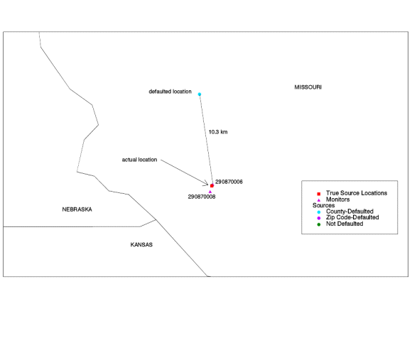
|
| Figure 6. Defaulted lead point source in Missouri.
The source is located right next to the monitors, but its location was
defaulted to 10 km from the monitors. |
The following table compares the model-to-monitor agreement before to
after.
| Table 12. Model-to-monitor agreement for Holt
County lead monitors, before and after source was accurately located. |
|
|
|
|
Defaulted (Before)
|
Corrected (After)
|
| Monitor ID |
State |
County |
Monitored Conc. (mg/m3) |
Modeled Conc.
(mg/m3) |
Underest. Factor |
Modeled Conc. (mg/m3) |
Underest. Factor |
| 290870006 |
Missouri |
Holt |
0.56
|
0.00
|
311
|
0.00
|
120
|
| 290870008 |
Missouri |
Holt |
0.56
|
0.00
|
350
|
0.01
|
50
|
|
The model estimates are still much lower than the monitors,
but the agreement is improved.
2) The Tennessee Source.
The source in Tennessee (NTI Site ID ES099) is in Memphis.
It emits 2.70 tons/year of lead and is close to two source-oriented
monitors in county 47157 (Shelby County, Tennessee).
One monitor is discordant, i.e., underestimation factor of
greater than 10, and the other is not. Defaulted, the
source was about 13 km from the monitors. Again, the
true location is right next to the monitors - within .1 km.
The only other large source in the area (3.2 tons/year) is
about 10 km away.
|
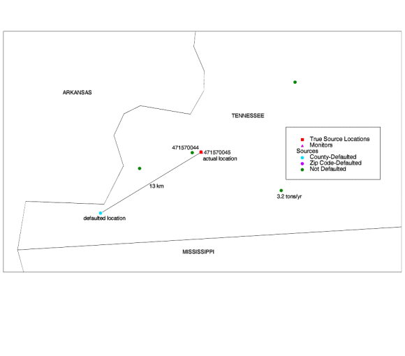 |
| Figure 7. Defaulted lead point source in Tennessee.
The source is located right next to the monitors, but its location was
defaulted to 13 km from the monitors. The correction improved the
model-to-monitor agreement considerably. |
The following table compares the model-to-monitor agreement before to
after for these two monitors.
| Table 13. Before-and-after model-to-monitor agreement
for Shelby County lead monitors. |
|
|
|
|
Defaulted (Before)
|
Corrected (After)
|
| Monitor ID |
State |
County |
Monitored Conc. (mg/m3) |
Modeled Conc.
(mg/m3) |
Underest. Factor |
Modeled Conc.
(mg/m3) |
Underest. Factor |
| 471570044 |
Tennessee |
Shelby |
1.80
|
0.01
|
327
|
0.29
|
6
|
| 471570045 |
Tennessee |
Shelby |
0.99
|
0.01
|
181
|
0.04
|
24
|
Agreement here improves quite a bit, even though the source is not that
large.
3) The Florida Source. The source
in Florida (NTI Site ID EM3440) is in Tampa. It emits 0.60 tons/year
of lead, and is close to the three discordant monitors in Hillsborough
County, Florida. Defaulted, was about 5.9 km from two of the monitors
and 16 km from the third. Its true location is 4.85 from the pair
and 6.12 km from the other.
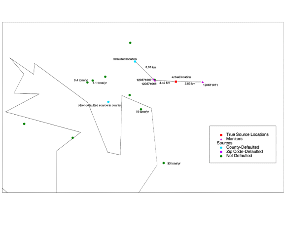 |
| Figure 8. Defaulted lead point source in Florida.
The correction did not improve model-to-monitor agreement in this case.
It is possible that there is a large point source near the monitors which
is missing from or mislocated in the NTI. |
The following table compares the model-to-monitor agreement before to
after for these three monitors.
| Table 14. Before-and-after model-to-monitor agreement
for Hillsborough County lead monitors. |
|
|
|
|
Defaulted (Before)
|
Corrected (After)
|
| Monitor ID |
State |
County |
Monitored Conc. (mg/m3) |
Modeled Conc.
(mg/m3) |
Underest. Factor |
Modeled Conc.
(mg/m3) |
Underest. Factor |
| 120571066 |
Florida |
Hillsborough |
0.48
|
0.01
|
72
|
0.01
|
83
|
| 120571067 |
Florida |
Hillsborough |
0.42
|
0.01
|
56
|
0.01
|
63
|
| 120571071 |
Florida |
Hillsborough |
1.69
|
0.00
|
565
|
0.00
|
691
|
| Because the source is small and its true location is not too far away
from its defaulted location, the model estimates did not change drastically,
and these monitors are underestimated drastically. The underestimation
factors at all three monitors actually increased slightly.
This is in part due to the other changes in the modeling system between
the penultimate and final model runs. It is possible that a source
is missing or mislocated that should appear near these monitors, particularly
at monitor 120571071 which has an especially severe underestimate.
There is another source of similar size (0.50 tons/year) which is also
defaulted in this county. We do not know its true location.
There are large sources in the area for which the state reported location
had no obvious problems, but these are not reported to be particularly
close to the three monitors (about 19 km away).
In the first two before-and-after cases, when we located the source
correctly, the model estimates were much improved, but still lower than
the monitor averages. The best agreement we found was an underestimation
by a factor of six, for monitor ID 471570044.
This result suggests that location defaulting can contribute significantly
to underestimation for source-oriented lead monitors, but it is not the
only cause.
One of the most interesting discordant monitors is 170310068.
It is in Chicago, very close to Lake Michigan and the Indiana state line.
This site and the surrounding area are shown in the map below.
There are six large (>1 ton/year) sources in Indiana which fall within
50 km of this monitor. These are circled in the map.
One possible explanation for the underestimate at this site is that
these six large Indiana sources are mislocated. In general, many
of the Indiana sources have reported locations which place them in Kentucky
and Ohio, probably south and east of their true locations. So some
of the Indiana sources are offset to the southeast. If the six large
Indiana sources in the circle are moved northwest, they will be much closer
to the monitor than they are now, which would presumably increase the model
estimate at the monitor site. Overall, of the 1333 lead emissions
sources identified as belonging to Indiana, 155 (11.6%) have latitude/longitude
coordinates that place them outside of Indiana, accounting for 5.7% of
the emissions. This would also explain the underestimate at the monitor
in Indiana (180350008).
Further support for the theory that these six sources are mislocated
comes from the surrounding area. There are no big cities near the
circled sources. If they are moved northwest, they move into the
heavily industrialized cities of Hammond and Gary. |
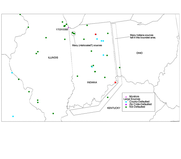
|
| Figure 9. Possible mislocated point sources in Indiana.
Some of the Indiana sources are offset to the southeast. We wonder
if the sources in the circle are offset to the southeast as well.
(Only sources with emissions > 1 ton/year are shown here.) |
In light of these results, it is possible that the current state of
the NTIs source location data precludes point-to-point model-to-monitor
comparisons for point source oriented monitors, particularly for metals
concentrations which tend to decay rapidly with distance from the source
due to their high particle size and weight. We wonder if point-to-point
model-to-monitor comparisons for source-oriented monitors should be done
only on a small scale, where emissions and source locations can be more
accurately characterized.
Lead seems to stand out as the most underestimated pollutant in the
comparison. This may be due to the large number of source oriented
monitors, but even the other monitors are underestimated, and the MAXTOMON
methods did not significantly change this. We wonder if there really
is reentrainment going on, or something else causing lead emissions to
be underestimated nationwide.
ii) Cadmium.
Of the 20 cadmium monitors, 7 are in the Chicago area, and 6 are spread
throughout New York.
The 6 New York monitors are all underestimated by a factor of five or
greater. Two of the 7 Chicago monitors are estimated within a factor
of 2, with the other 5 being underestimated. However, there are higher
modeled concentrations within 30 km of all but one of these 13 monitors.
Nationwide, 15 of the 20 monitors have higher modeled concentations within
30 km. |
| Table 15. MAXTOMON table for cadmium.
For five of the 20 cadmium monitors, no higher modeled concentration can
be found within 30 km. |
|
|
Percent Missing Low at Radius Of: |
| Pollutant |
# Monitors |
0 km
(Exact Monitor
Location) |
2 km |
4 km |
6 km |
8 km |
10 km |
20 km |
30 km |
| Cadmium |
20 |
85% |
85% |
75% |
75% |
75% |
60% |
35% |
25% |
iii) Chromium.
Of the 36 chromium monitors, 10 are in Staten Island, NY; 8 are in the
Chicago area; and 14 are spread throughout California.
The ten monitors in Staten Island are all underestimated by factors
of between 6.64 and 8.30. The monitor averages are very similar among
the ten sites. There are no census tracts on Staten Island with modeled
concentrations similar to the monitors, but there are tracts within 20
km of the monitors with modeled concentrations higher than all 10 monitor
averages.
However, the eight monitors near Chicago are generally estimated accurately
at the monitor locations. The model-to-monitor ratios are all between
0.65 and 1.13, so all are easily estimated within a factor of 2, and all
but one are estimated within 30%.
The California monitors are estimated inconsistently. Only 2 of
the 14 are estimated within a factor of 2 at the exact monitor locations.
Of the other 12, 2 are overestimated and 10 are underestimated.
These state-to-state differences suggest differences in the state inventories.
The results for cadmium suggest the possibility that New York has low emissions
estimates for cadmium as well. Possible differences in monitoring
must also be considered.
VI. Conclusions
At the exact monitor locations, the model estimates were lower than the
monitor averages for most of the pollutant/monitor combinations.
Benzene was the only HAP which showed apparent good agreement at the exact
monitor locations. We didn't plan to adjust model estimates based
on the results of this model-to-monitor comparison, which we think is reasonable
given all the uncertainties involved. However, for some of the HAPs,
especially lead, it seems likely that the modeling system is systematically
underestimating monitored concentrations.
By "modeling system", we mean to emphasize that the estimates are the
result of:
emission estimates
+
spatial allocation estimates (within each county)
+
dispersion modeling (dispersion, deposition)
+
background estimates.
We tried to use the MAXTOMON test to see whether the model was mislocating
the peak concentrations, or systematically underestimating. On a
pollutant-by-pollutant basis, here are the percent of sites underestimated
at different radii, out to 50 km: |
| Table 16. MAXTOMON table for all pollutants, out
to a distance of 50 km. |
|
|
Percent Missing Low at Radius Of: |
| Pollutant |
# Monitors |
0 km
(Exact Monitor
Location) |
10 km |
20 km |
30 km |
40 km |
50 km |
| Benzene |
87
|
59%
|
25%
|
20%
|
11%*
|
8%
|
6%
|
| Perchloroethylene |
44 |
86% |
43% |
23% |
9%* |
7%
|
7%
|
| Formaldehyde |
32 |
88% |
56% |
31%* |
31% |
28%
|
25%
|
| Acetaldehyde |
32 |
91% |
56% |
38%* |
34% |
31%
|
31%
|
| Lead |
242 |
91% |
65% |
51%* |
40% |
36%
|
34%
|
| Cadmium |
20
|
85%
|
60%
|
35%*
|
25%
|
25%
|
25%
|
| Chromium |
36
|
83%
|
39%
|
28%*
|
25%
|
22%
|
17%
|
Each pollutant has a certain distance which we starred: in our opinion,
this is where the effect of the uncertainty distance starts to wane.
In general, we might say that the modeling system has uncertainty in locating
source impacts to within 20 km. But even as we go out to 50 km, many
of the pollutant/monitor combinations are still underestimated for all
HAPs except benzene and perchloroethylene. This suggests systematic
underestimation of the aldehydes and metals.
We look forward to receiving the monitoring data collected from the
pilot cities. This monitoring data will have fewer uncertainties
surrounding it than most of the data currently in the Archive. We
can compare the monitoring data from this network to future model runs.
In general, we think that the most effective way to improve agreement
between the model estimates and monitor averages is to improve the emissions
inventory. One possibility would be to conduct a study on a small
sample of sources, to see if the emissions rates are accurately estimated.
But if these model estimates are used on a local scale, we think it is
crucial to:
-
For pollutants dominated by point sources, get better data on the source
locations and releases.
-
For pollutants dominated by area sources, work on either improving our
spatial allocation methods or ceasing the pattern of aggregating to the
county level in the inventory, then disaggregating for modeling purposes.
-
Accurately estimate background concentrations, possibly on a regional basis
instead of nationwide.
As it stands now, we certainly think it is a mistake to attribute the model
estimates to a census tract. The spatial distribution of concentrations
within an area of any size is uncertain. Any particular model estimate
may be too high or too low, compared with actual conditions that existed
in 1996. However, the available data suggest that the model estimate
for any particular HAP/location combination is more likely to be lower
than actual 1996 conditions, rather than higher.
VII. References
1See https://www.epa.gov/oppecumm/air/air.htm.
2Rosenbaum, A.S., Stiefer, P.S., and Iwamiya, R.K., (1999):
Air Toxics Data Archive and AIRS Combined Data Set: Data Base Descriptions.
Prepared for US EPA by Systems Applications International, SYSAPP 98/05r.
3Code of Federal Regulations, Title 40, Part 136, Appendix
B, Revision 1.11.
4Curran, T.C., and Steigerwald, B.G., (1982): Data Analysis
Consequences of Air Quality Measurement Uncertainty. Paper presented
at the 75th Annual Meeting of the Air Pollution Control Association,
New Orleans, Louisiana, June 1982.
5Meade, P.J., and Pasquill, F., (1958): A study of the average
distribution of pollution around Stayhorpe. Int. J. Air Pollution.
Pergamon Press. Vol. 1, pp. 60-70.
6Lucas, D.H., (1958): The Atmospheric Pollution of Cities.
Int.
J. Air Pollution. Pergamon Press. Vol. 1, pp. 71-86.
7Pooler, F., (1961): A prediction model of mean urban pollution
for use with standard wind roses. Int. J. Air and Water Pollution.
Vol. 4(3/4):199-211.
8Martin, D.O., (1971): An urban diffusion model for estimating
long term average values of air quality. J. of the Air Pollution
Control Association. Vol 21(1):16-19.
9Calder, K.L., (1971): A climatological model for multiple
source urban air pollution. Paper presented at First Meeting of the
NATO/CCMS Panel on Modeling. Paper published in Appendix D of Users
Guide for the Climatological Dispersion Model. EPA-R4-73-024.
Office of Research and Development, U.S. Environmental Protection Agency,
Research Triangle Park, NC 27711, pages 73-105.
10Turner, D.B. and Edmisten, N.G., (1968): St. Louis SO2
dispersion model study - description of basic data. (Unpublished
report, Division of Meteorology, NAPCA). Atmospheric Sciences Modeling
Division, U.S. Environmental Protection Agency, Research Triangle Park,
NC 27711.
11Turner, D.B., Zimmerman, J.R., and Busse, A.D., (1971):
An evaluation of some climatological models. Paper presented at Third
Meeting of the NATO/CCMS Panel on Modeling. Paper published in Appendix
E of Users Guide for the Climatological Dispersion Model.
EPA-R4-73-024. Office of Research and Development, U.S. Environmental
Protection Agency, Research Triangle Park, NC 27711, pages 107-131.
12Briggs, G.A., (1969): Plume Rise. TID-25075.
U.S. Atomic Energy Commission, Available from the National Technical Information
Service, U.S. Department of commerce, Springfield, VA 22151, 85 pages.
13Holland, J.A., (1953): A meteorological survey of the
Oak Ridge area: final report covering the period 1948-1952. U.S.
AEC Report ORO-99. Technical Information Service, Weather Bureau,
Oak Ridge, TN. pages 554-559.
14Irwin, J.S. and Brown, T.M., (1985): A sensitivity analysis
of the treatment of area sources by the Climatological Dispersion Model.
J.
of the Air Pollution Control Association. Vol 35(4):39-364.
15McElroy, J.L. and Pooler, F., (1968): St. Louis Dispersion
Study Volume II-Analysis. National Air Pollution Control Administration.
Publication Number AP-53. U.S. Department of Health Education and
Welfare, Arlington, VA, 51 pages.
16Gifford, F.S., (1976): Turbulent diffusion-typing schemes:
a review. Nuclear Safety. Vol 17(1):68-86.
17Turner, D.B. and Novak, J.H., (1978): Users Guide for
RAM, Volume 1, Algorithm Description and Use. EPA-600/8-78-016a.
Office of Research and Development, U.S. Environmental Protection Agency,
Research Triangle Park, NC 27711, 70 pages.
18U.S. EPA, (1995): Users Guide for the Industrial Source
Complex (ISC3) Dispersion Models, Volume I - User Instructions.
EPA-454/B-95-003a. Office of Air Quality Planning and Standards,
U.S. Environmental Protection Agency, Research Triangle Park, NC 27711,
320 pages.
19Turner, D.B. and Irwin, J.S., (1983): Comparison of sulfur
dioxide estimates from the model RAM with St. Louis measurements. Air
Pollution Modeling and Its Application II, (Edited by C. De Wispelaere),
Plenum Press, pages 695-707.
20Gifford, F.A. and Hanna, S.R., (1973): Modeling urban air
pollution. Atmospheric Environment. (7):131-136.
21Hanna, S.A., Briggs, G.A., and Hosker, R.P., (1982): Handbook
on Atmospheric Diffusion. Available as DE82002045 (DOE/TIC-11223)
from the National Technical Information Service, U.S. Department of Commerce,
Springfield, VA, 22161, 108 pages.
22U.S. EPA, (1999): A simplified approach for estimating
secondary production of hazardous air pollutants (HAPS) using the OZIPR
model. EPA-454R-99-054. U.S. Environment Protection Agency,
Research Triangle Park, NC 27711, 86 pages. |
|
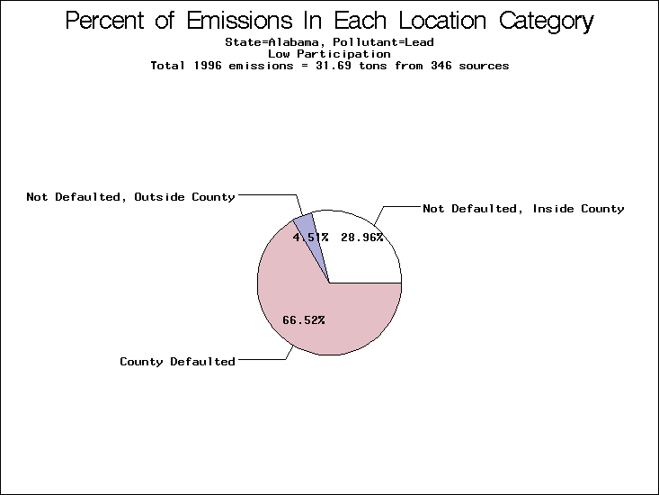
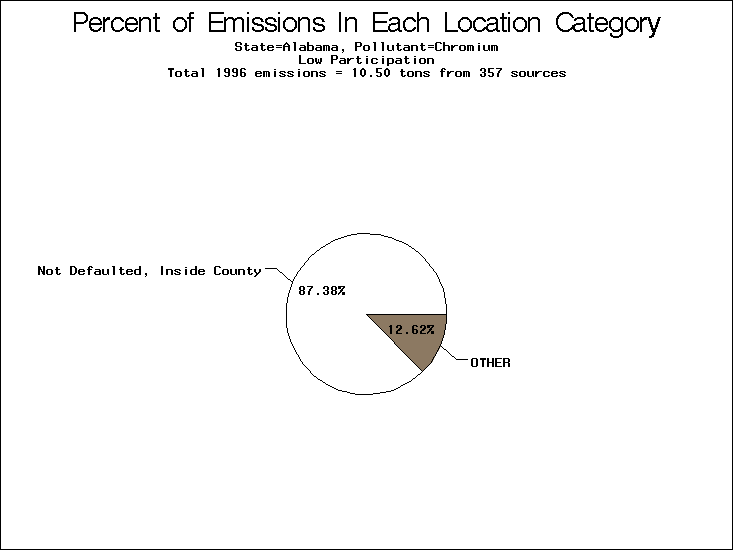
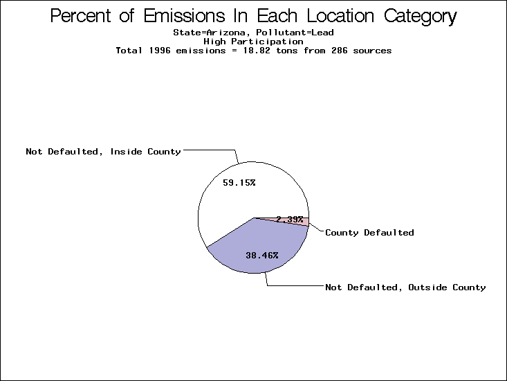
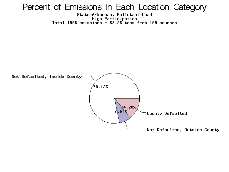
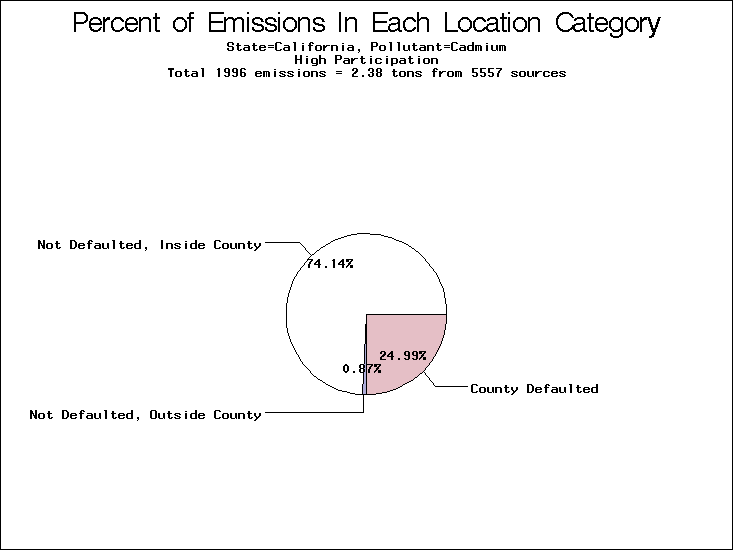
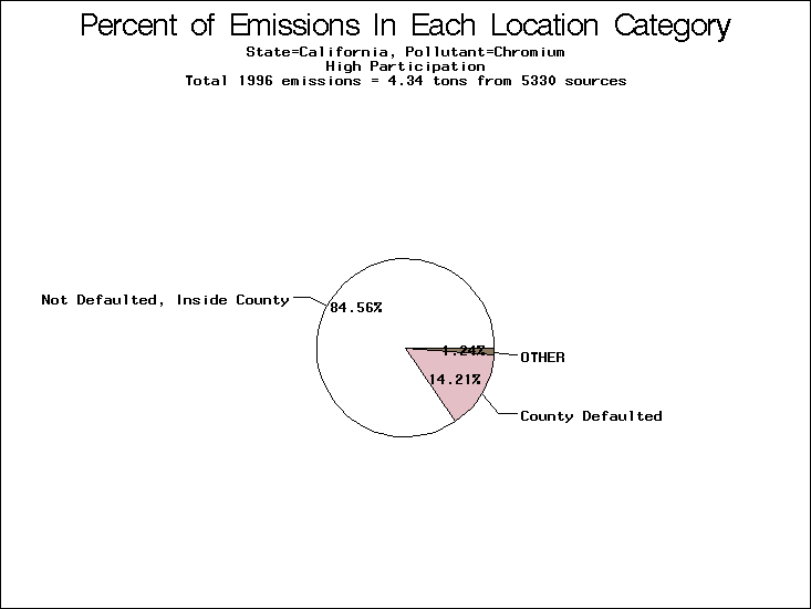
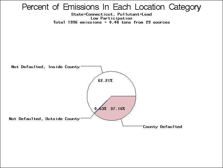
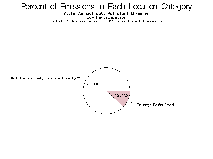
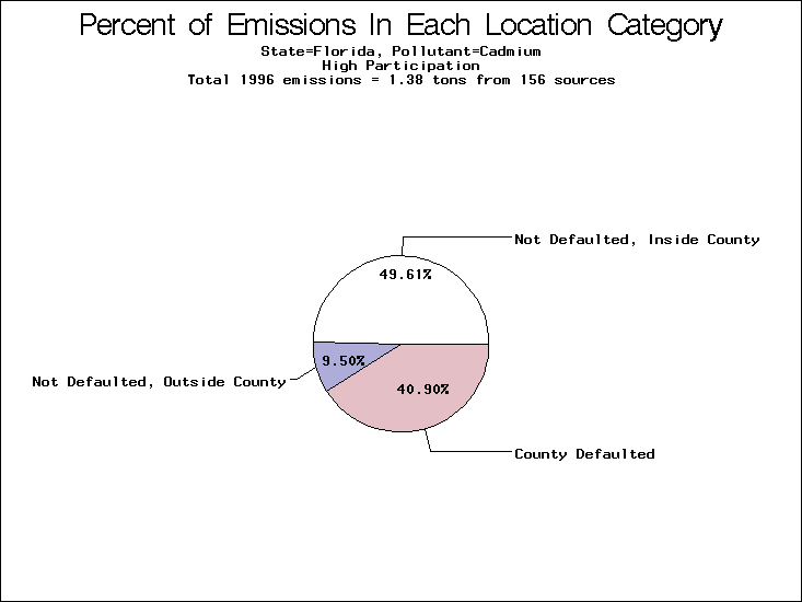
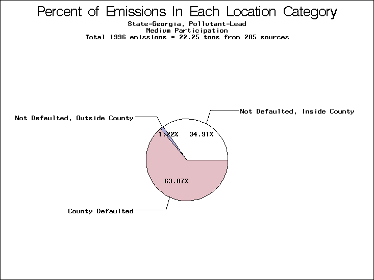
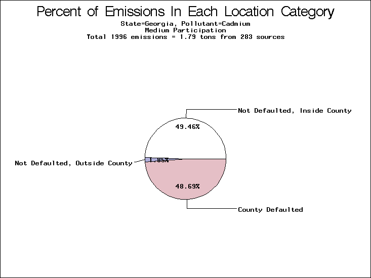
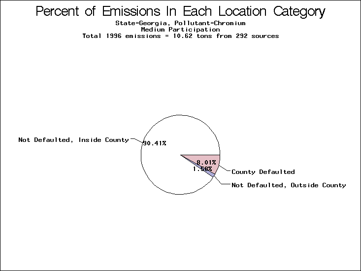
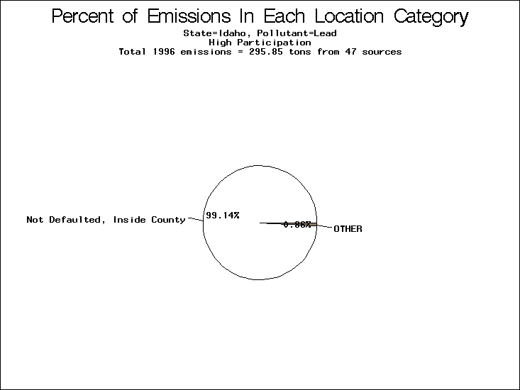
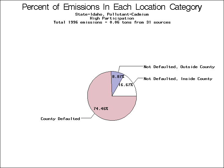
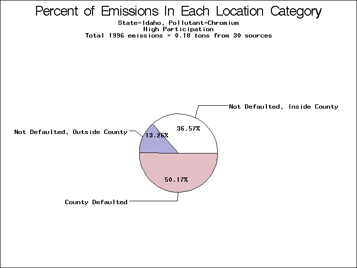
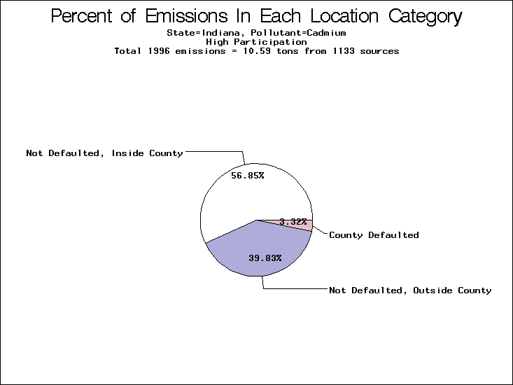
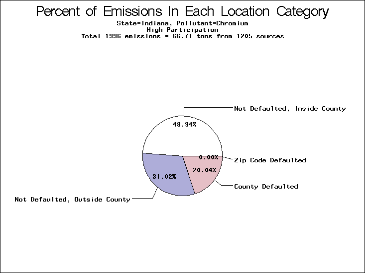
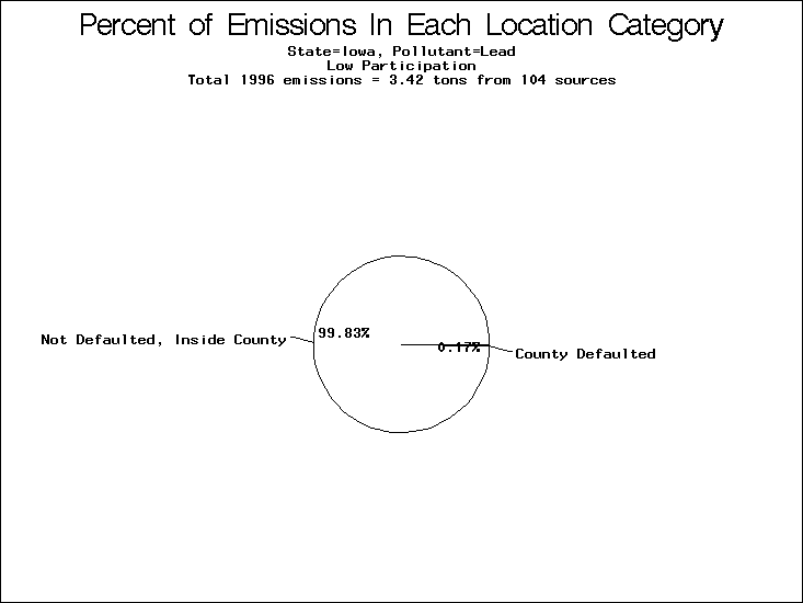
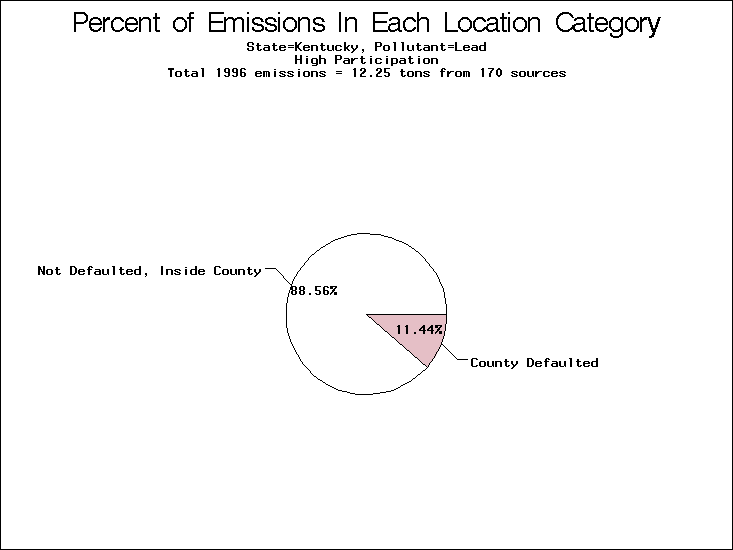
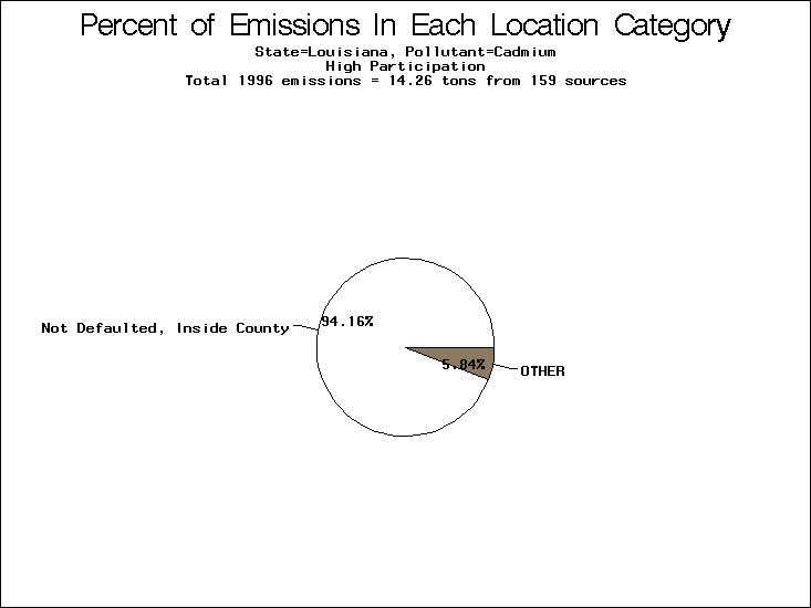
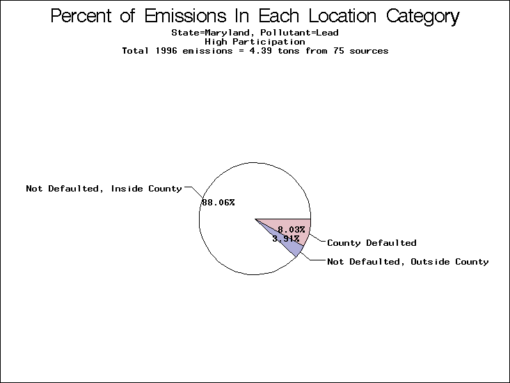
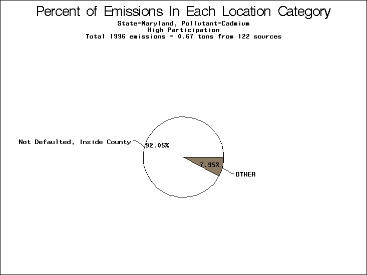
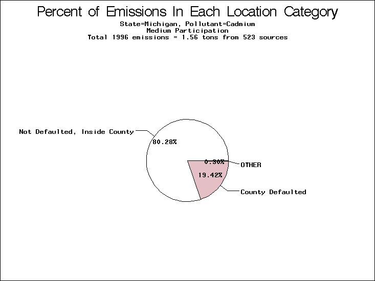
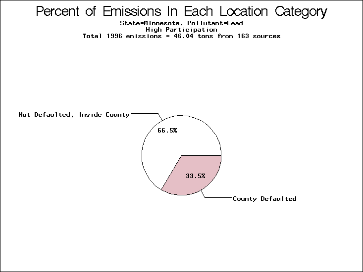
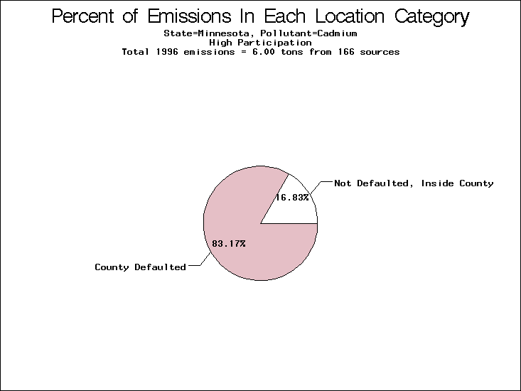
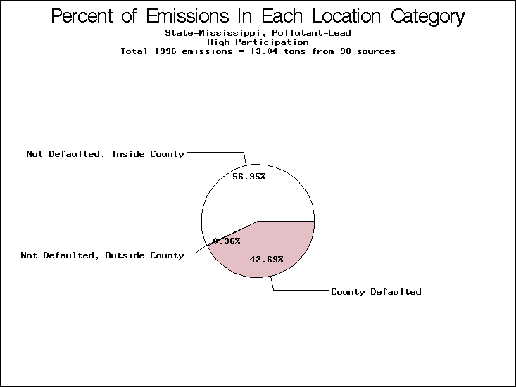
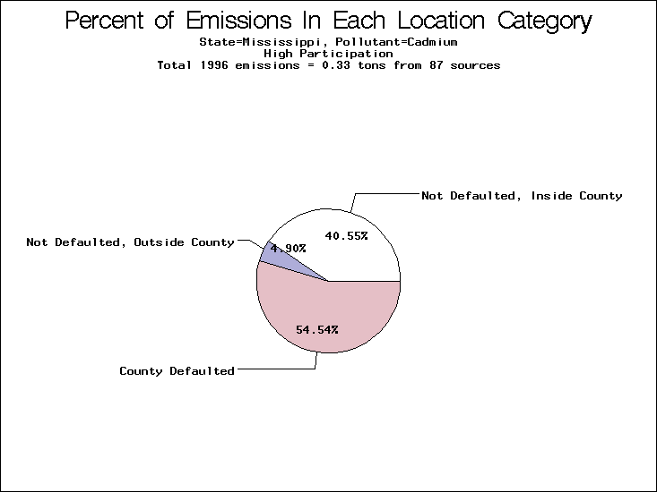
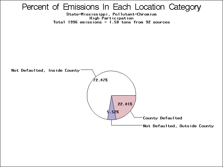
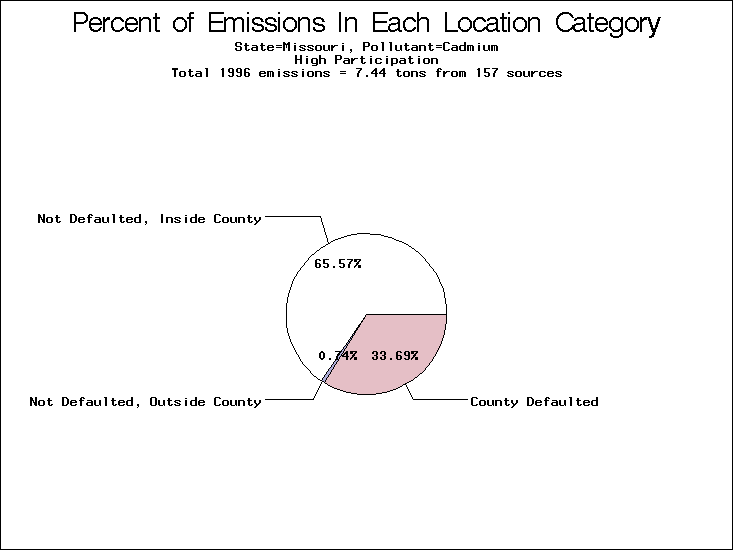
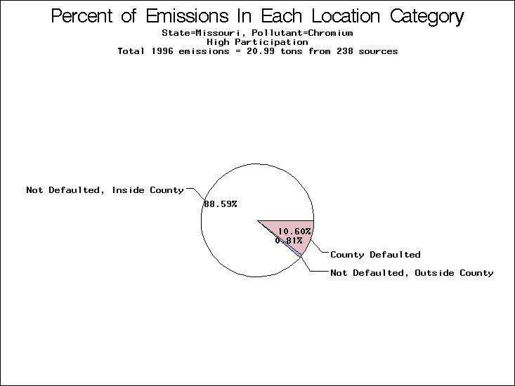
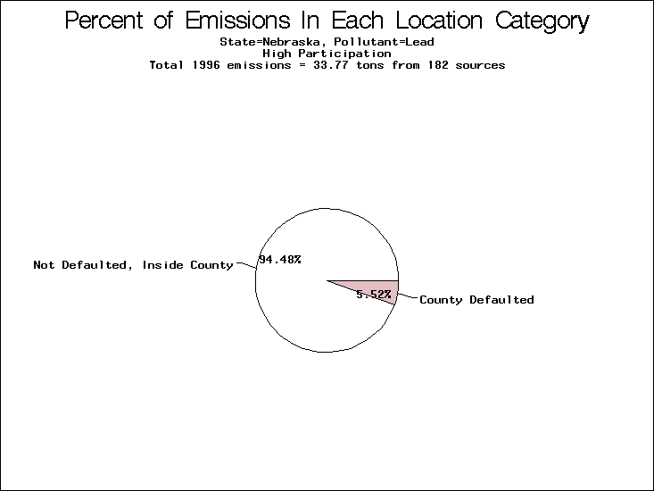
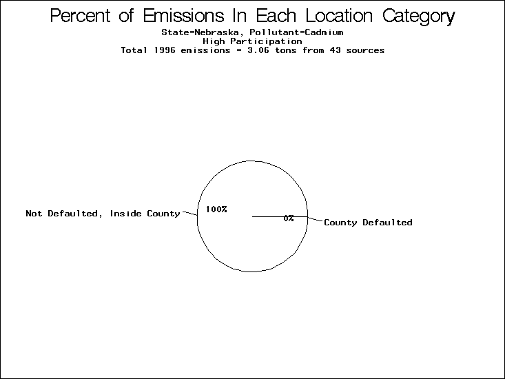
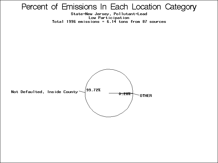
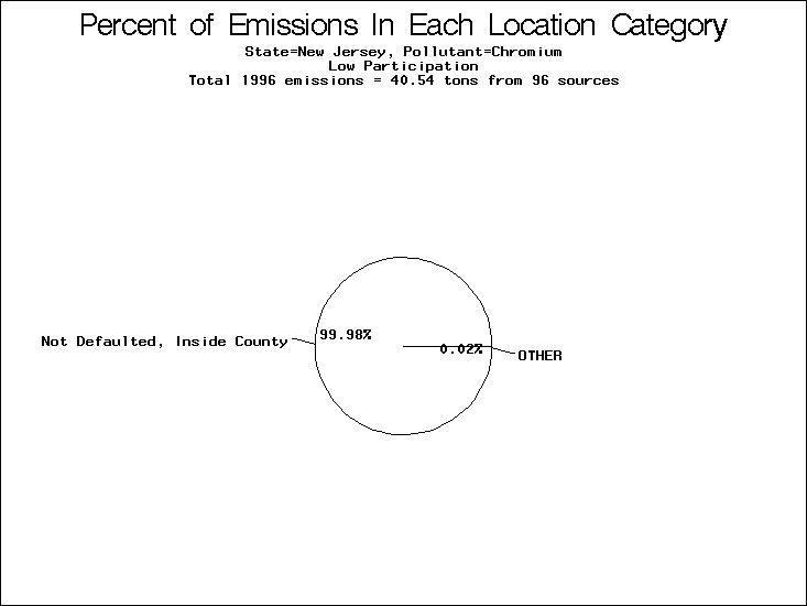
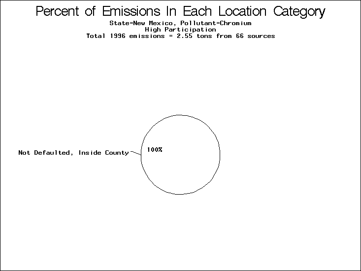
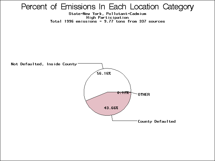
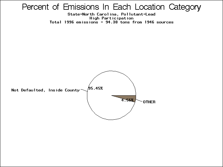
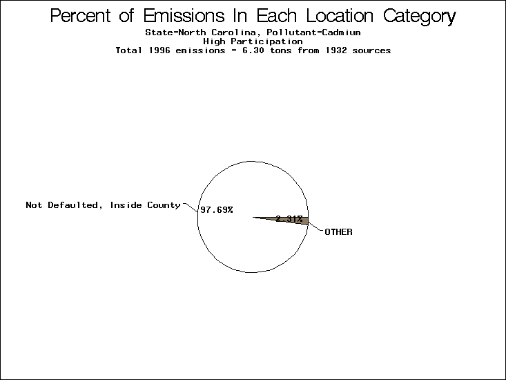
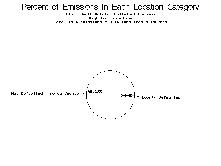
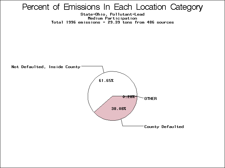
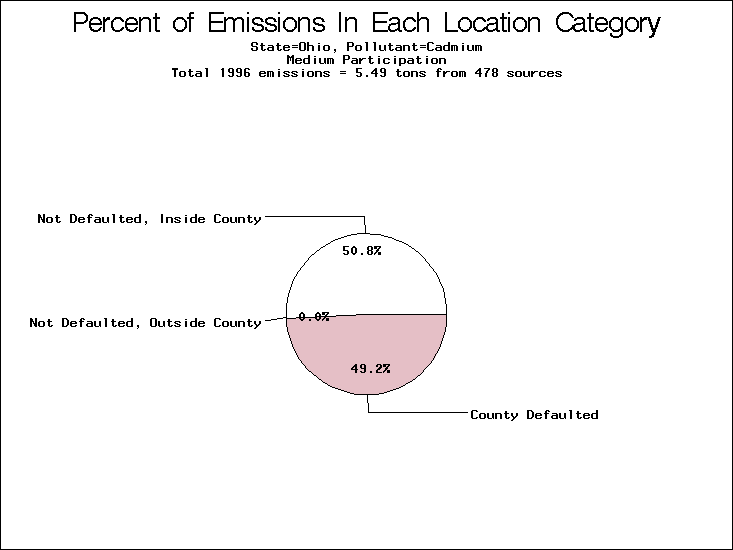
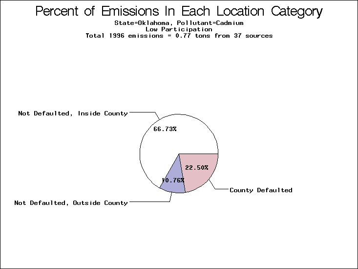
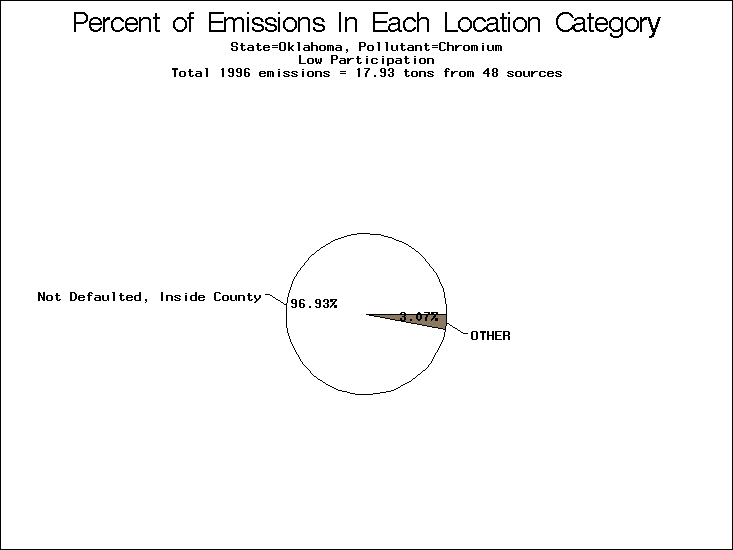
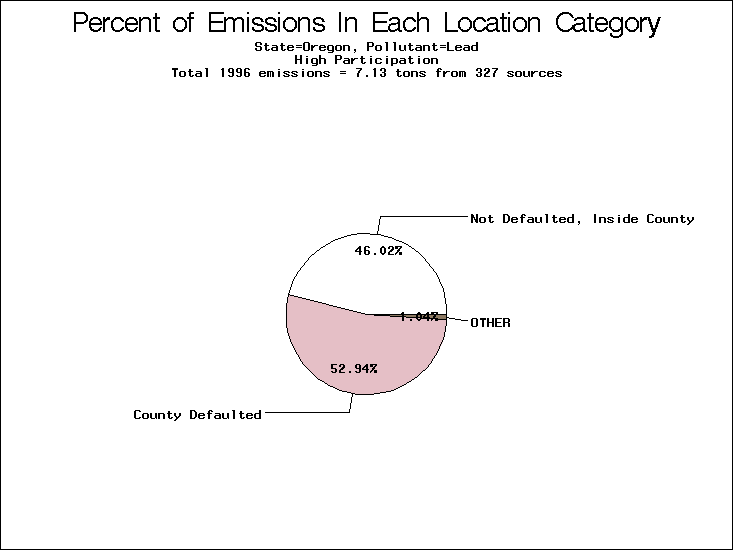
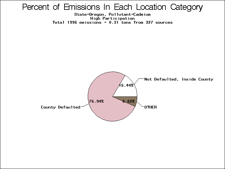
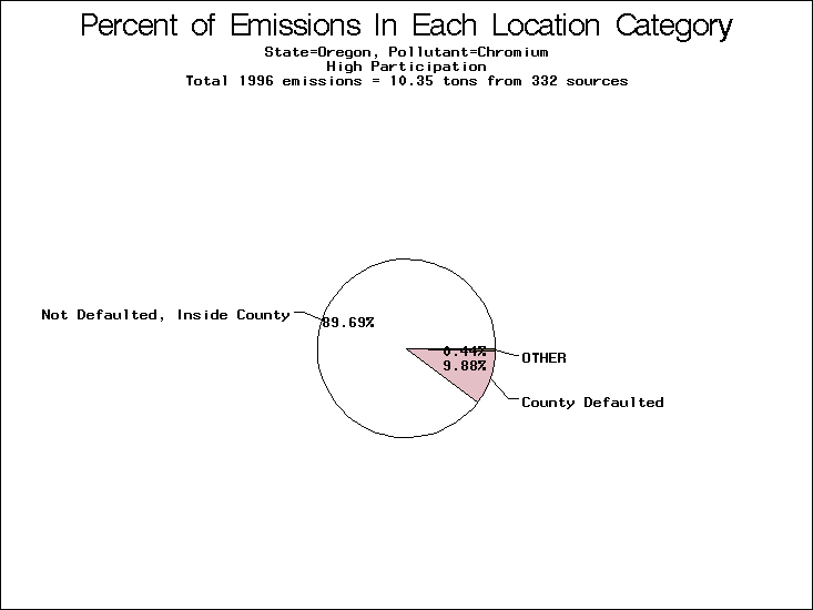
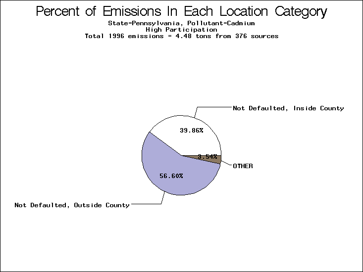
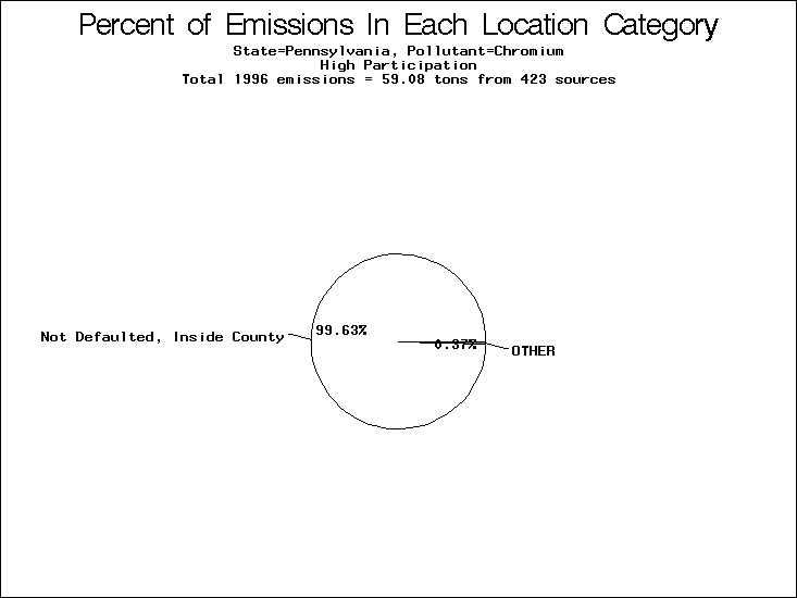
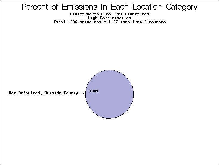
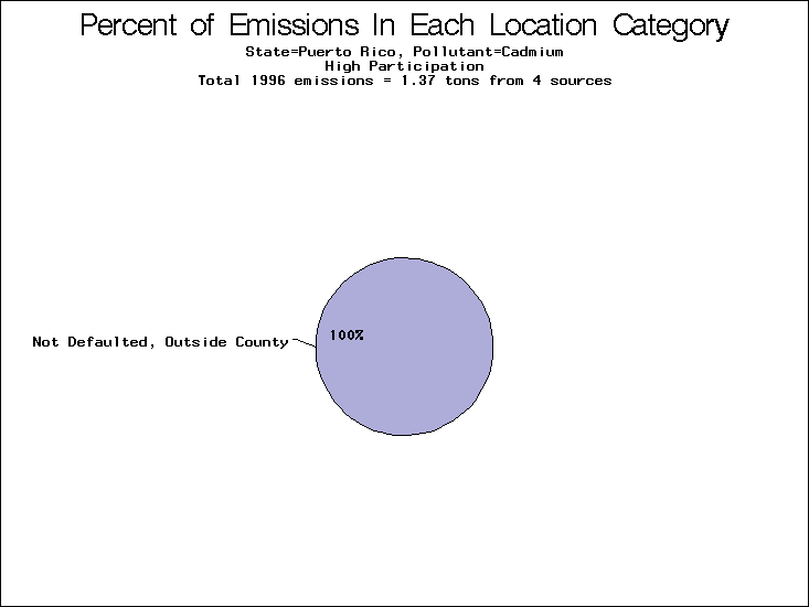
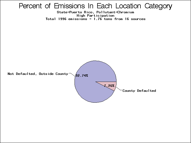
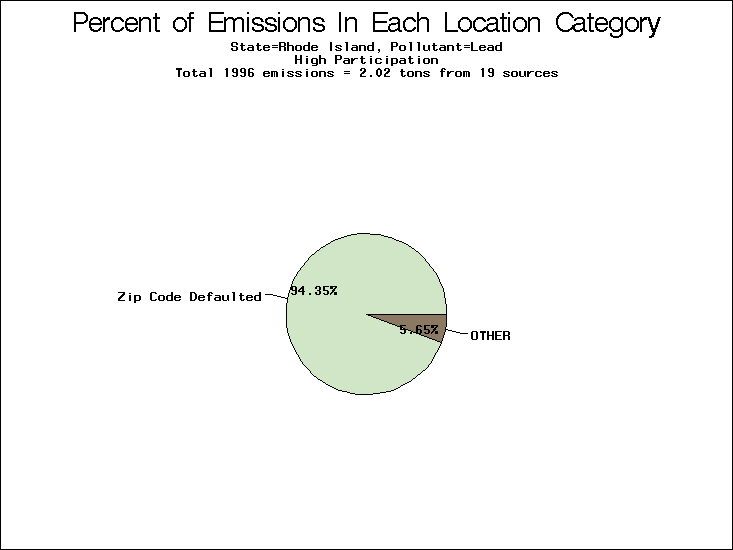
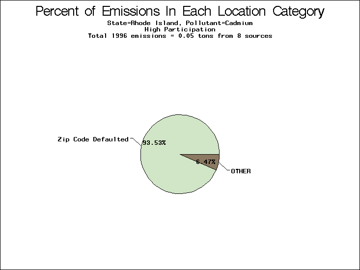
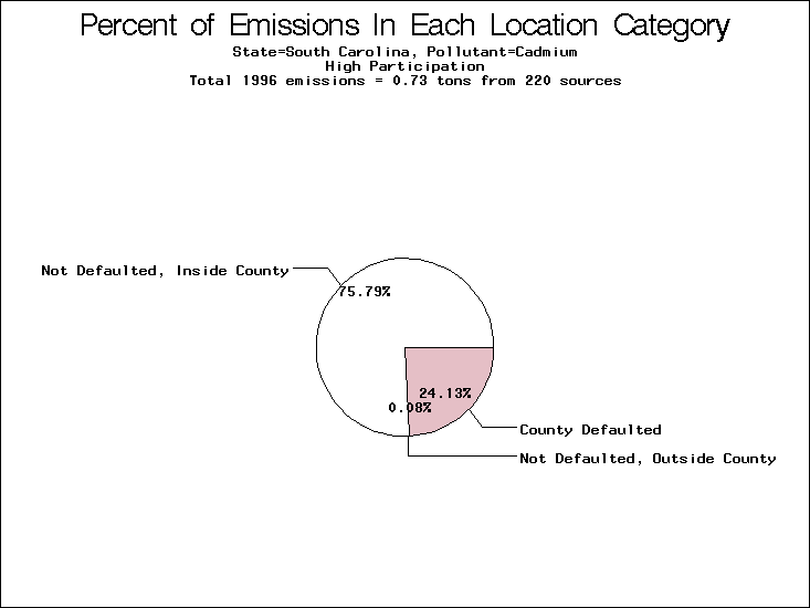
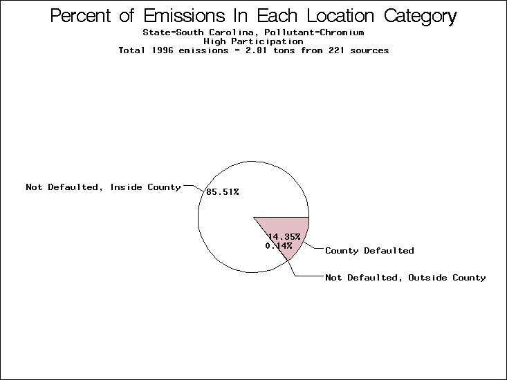
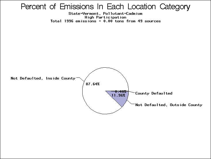
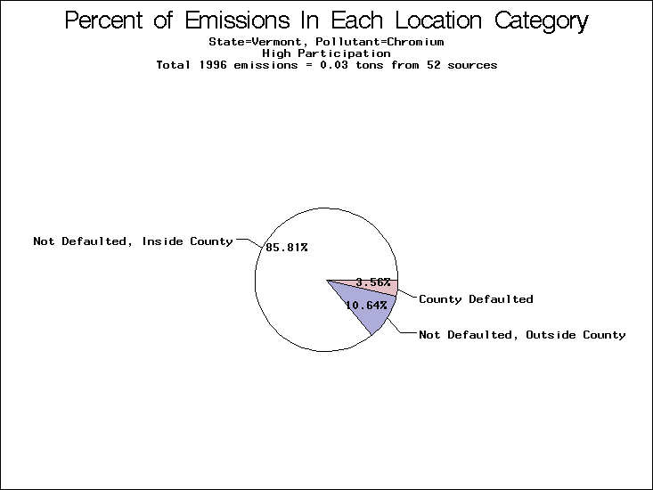
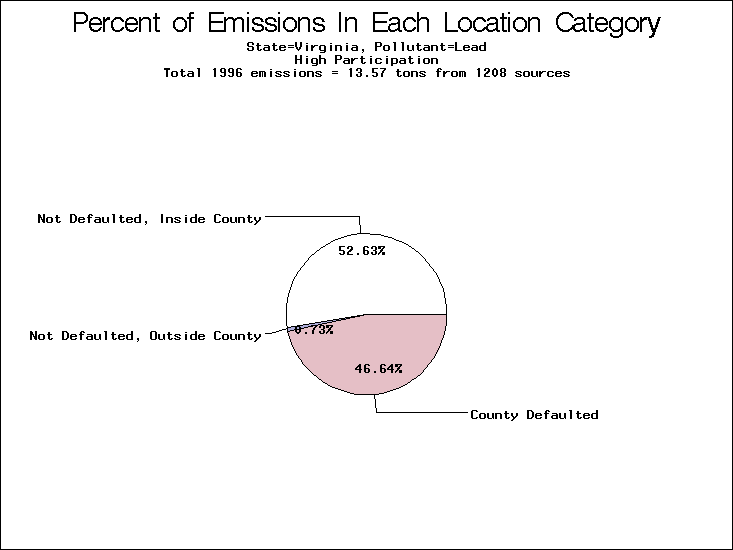
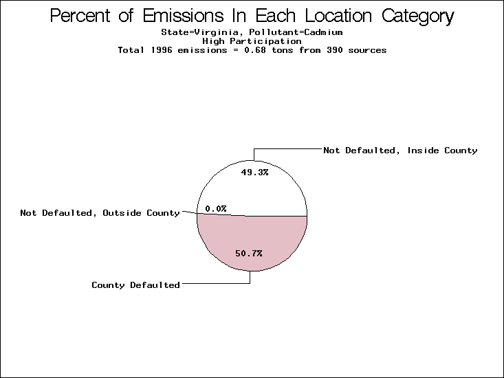
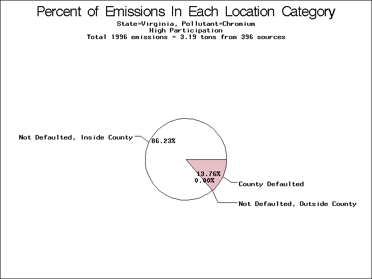
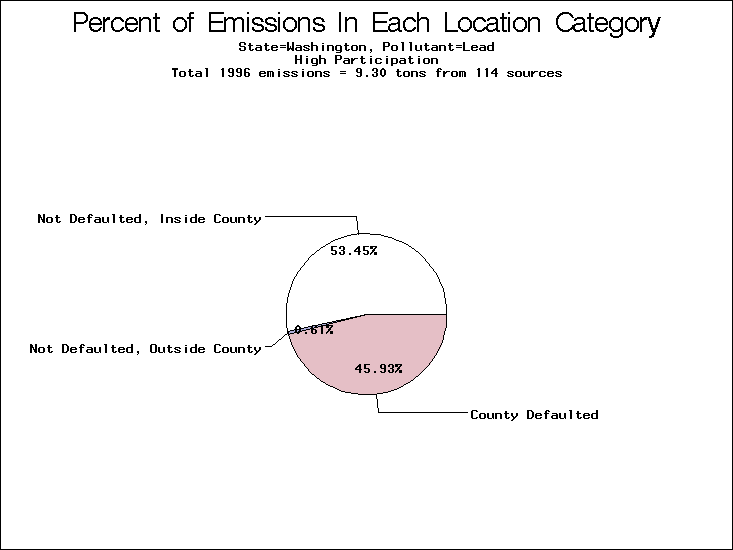
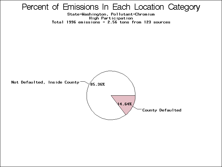
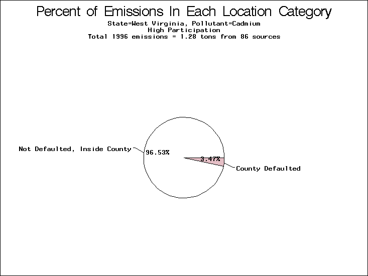
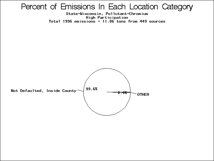