ECOFRAM: Aquatic Risk Assessment
Jeffrey Giddings
Springborn Laboratories Inc.
Paul Hendley
Zeneca Ag Products.
On this Page
- Risk Quotient Equation
- Probabilistic Risk Characterization
- Exposure Distribution
- Exposure Analysis
- Probability of Exceeding LC50
- Probability of Mortality
- Extrapolation to Population Effect
- Another Endpoint: the PR50
- Probability of Population Decline
- Distribution of Species Sensitivity
- Probability of Affecting Species
- Pulsed Exposure
- Assessing Effects of Pulsed Exposures
- Other Components of Effects Analysis
- Outstanding Issues
- Summary of Tools for Effects Assessment
- Risk Assessment Process
Risk Quotient = Exposure Concentration / Effect Concentration
Probabilistic Risk Characterization
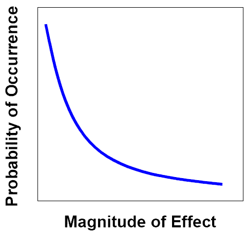
Probabilistic Risk Characterization
Exposure Distribution
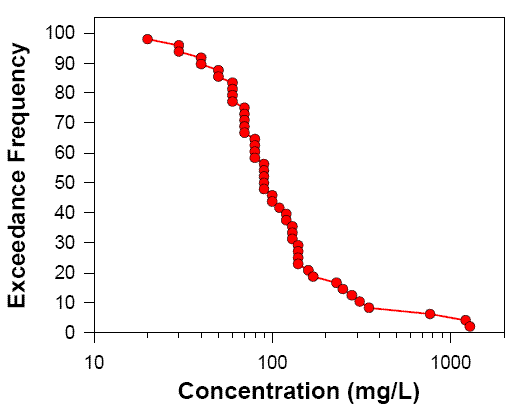
Exposure Distribution
Exposure Analysis
Step 1: Deterministic; edge of field/pond, worst case (GENEEC)
Step 2: Probabilistic; more chemical information; variation with weather, region, receiving water type (PRZM/EXAMS)
Step 3: Probabilistic; landscape and watershed factors
Probability of Exceeding LC50
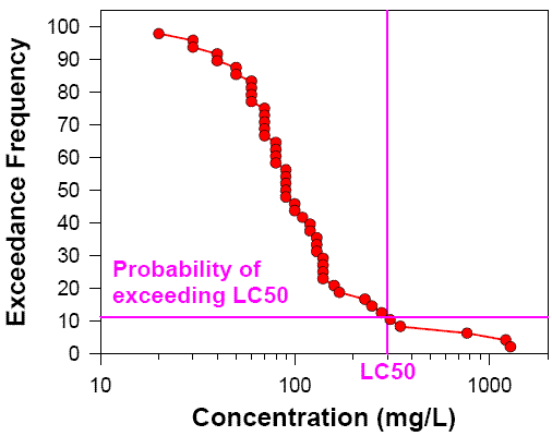
Probability of Exceeding LC50
Probability of Mortality
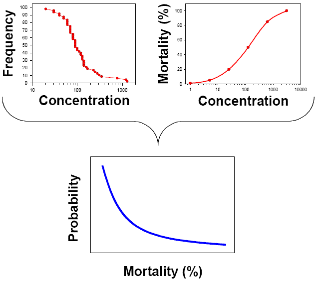
Probability of Mortality
Extrapolation to Population Effect
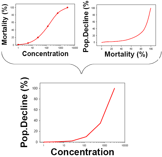
Extrapolation to Population Effect
Another Endpoint: the PR50
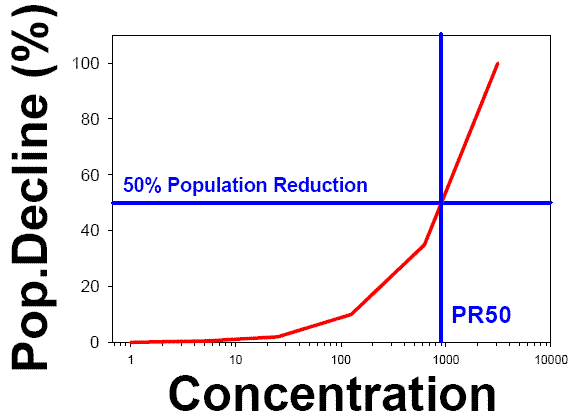
Another endpoint: the PR50
Probability of Population Decline
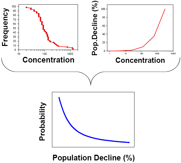
Probability of Population Decline
Distribution of Species Sensitivity
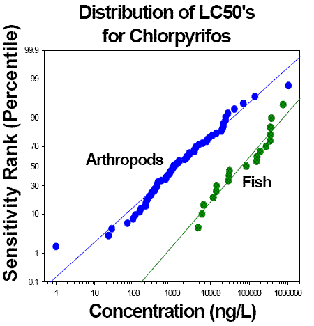
Distribution of LC50's for Chlorpyrifos
Probability of Affecting Species
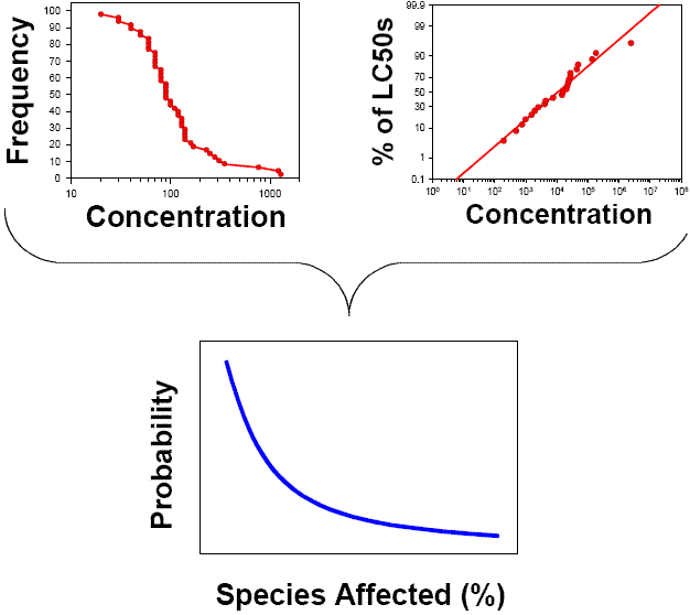
Probability of Affecting Species
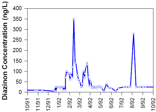
Pulsed Exposure
Diazinon Concentrations
San Joaquin River at Laird Park
1991-1992
Assessing Effects of Pulsed Exposures
Time-to-event analysis
Laboratory toxicity tests simulating simplified pulses
Uptake / depuration models linked to critical body residue data
Other Components of Effects Analysis
Chronic toxicity
Reproductive effects
Sediment exposure
Behavioral endpoints
Outstanding Issues
Overall ecosystem damage
extrapolation from populations to ecosystems
microcosms and mesocosms provide insight
Mixtures, multiple stressors
Summary of Tools for Effects Assessment
Time-to-Event Analysis
Pulsed Exposures
Population Models
Sensitivity Distributions
Sediment Toxicity Evaluation
Chronic Toxicity Tests
Mesocosms and Microcosms
Behavioral Toxicity Tests
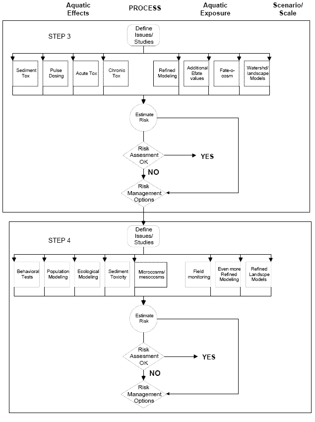
Risk Assessment Process
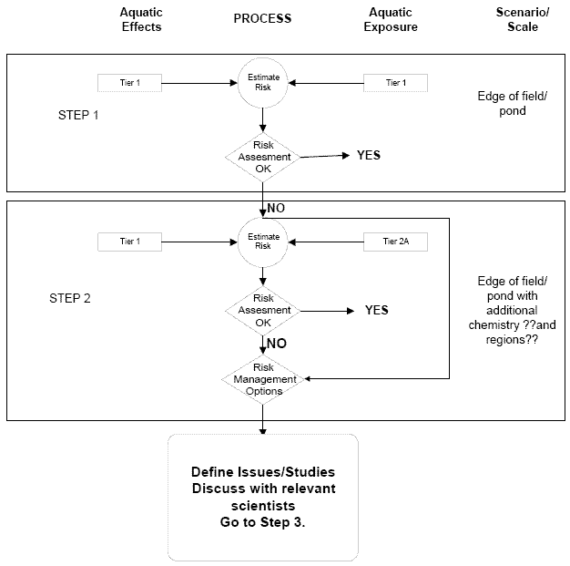
Risk Assessment Process (Steps 1 and 2)
Risk Assessment Process (Steps 3 and 4)