PRELIMINARY FINDINGS OF THE ECOLOGICAL COMMITTEE ON FIFRA RISK ASSESSMENT METHODS (ECOFRAM): VII. AQUATIC RISK CHARACTERIZATION AND TIERED RISK ASSESSMENT PROCESS
ECOFRAM Aquatic Exposure and Effects Subcommittees
On this Page
Abstract
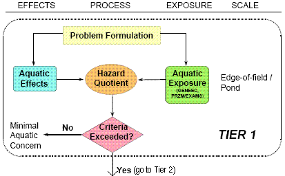
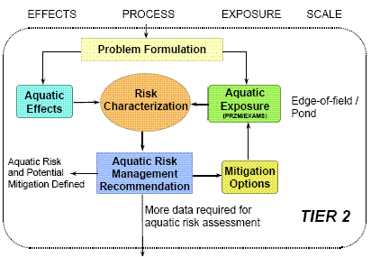
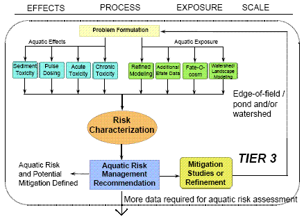
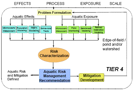
The Aquatic Exposure and Aquatic Effects Subcommittees of ECOFRAM have developed a tiered scheme for aquatic risk assessment of pesticides, consistent with the EPA's Framework for Risk Assessment, that integrates new developments in exposure and effects analysis. The lowest tier of the risk assessment process incorporates generic worst-case exposure modeling and a standard set of acute and chronic toxicity tests. Risk characterization at the lowest tier is based on risk quotients. At higher tiers, exposure is expressed probabilistically (see Poster V) and effects are expressed in terms of population- and community-level assessment endpoints as well as individual-based measurement endpoints (see Poster VI). Risk is characterized in the higher tiers as a function of probability of exposure and magnitude of ecological effect. Risk mitigation options (aimed at reducing exposure) are evaluated after each phase of the assessment. Results of risk characterization are conveyed to risk managers, who weigh the risks and benefits associated with each pesticide before making decisions on product registration.
Aquatic Risk Assessment Process
Tier 1 Flow Diagram
Tier 2 Flow Diagram
Tier 3 Flow Diagram
Tier 4 Flow Diagram
Risk Characterization
Integrating Exposure and Effects Distributions into a Joint Probability Curve
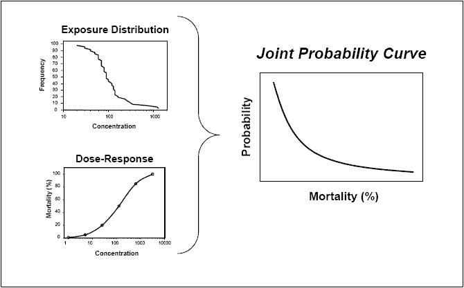
Integrating Exposure and Effects Distributions into a Joint Probability Curve
Using Joint Probability Curves to Evaluate Relative Risk
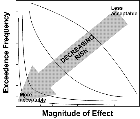
Using Joint Probability Curves to Evaluate Relative Risk
Using Joint Probability Curves to Make Risk Management Decisions
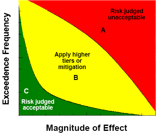
Using Joint Probability Curves to Make Risk Management Decisions